NationBuilder
Surgical page redesigns that move conversion metrics
Client

NationBuilder
Role
Web Design & Strategy Partner
Timeline
10–14 weeks
Scope
Tech Stack
The Brief
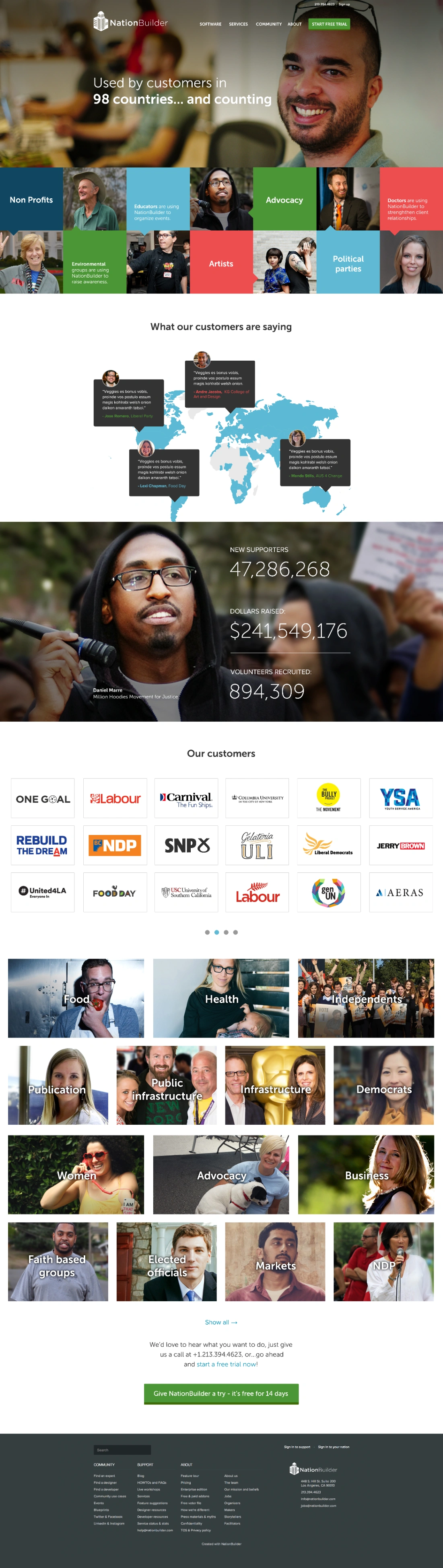
NationBuilder's platform serves meaningfully different audiences — nonprofit directors, campaign managers, advocacy leads — and each segment has different purchase triggers, different objections, and different mental models of what software like this is for. The existing pages weren't making clear, fast cases to any of them. The information hierarchy was flat, value propositions were buried, and the visual language didn't carry the authority the platform had earned over a decade of use by some of the world's most recognized advocacy organizations. The problem wasn't brand — NationBuilder's identity was established. The problem was that critical pages in the funnel weren't converting that brand equity into confidence at the moment a prospective customer was deciding whether to book a demo or start a trial. An in-house team stretched across product and platform work couldn't hold the focused design and strategic attention these pages needed. Boneyard's profile — small senior team, design and strategy under one roof, fluent in SaaS marketing pages and conversion-oriented UX — made it the right fit for work that needed to move fast without sacrificing quality or strategic grounding.

What we did
The first priority was getting the strategy right before touching visual design. That meant working through the specific job each page needed to do: who arrives here, what do they already believe, what objection are they most likely carrying, and what does success look like for this page specifically. That framing shaped every structural decision downstream — section order, what information got prominent placement, where calls to action lived, and what could be cut. The deliberate choice was to keep NationBuilder's existing visual language largely intact and focus creative energy on structure and hierarchy rather than introducing a new aesthetic system that would have created inconsistency across the site. Design execution ran page by page, with each one treated as its own UX problem rather than a template-fill exercise. Component choices, typographic hierarchy, and content pacing were all driven by the strategic brief developed in phase one. The pages were designed for production — not concepts to hand off to a separate production team, but designs that could go directly to dev. That tight loop between strategy and execution, without a handoff gap in the middle, is where the quality stayed consistent.
The outcome
The delivered pages raised the design quality bar on the parts of nationbuilder.com most likely to influence whether a prospect converts. Each page now has a cleaner argument — a clearer hierarchy, a more direct path to the primary CTA, and a visual weight appropriate to the audience it's addressing. For a company where demo bookings and trial starts are the core pipeline metrics, pages that do this job better have direct commercial impact. Internally, the engagement also produced a tighter strategic framework for how NationBuilder thinks about audience-specific pages — what questions each segment needs answered, and in what order. That's reusable thinking, not just reusable design.
Part 01
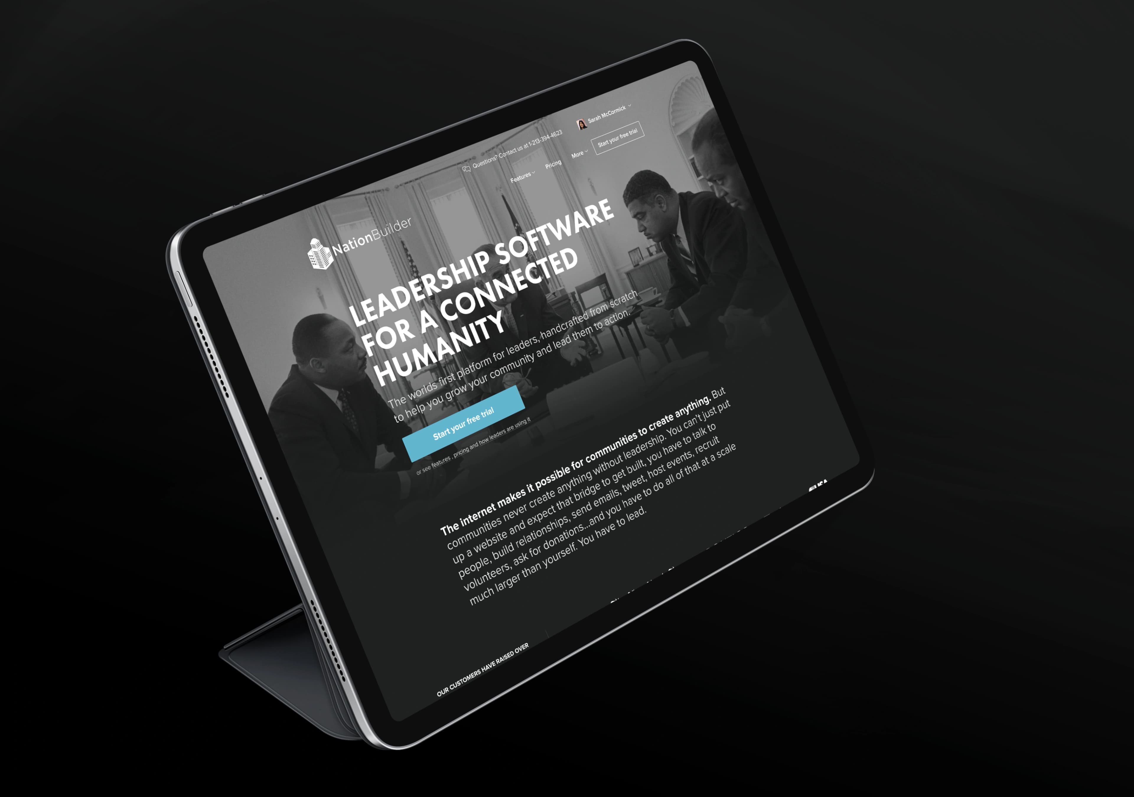
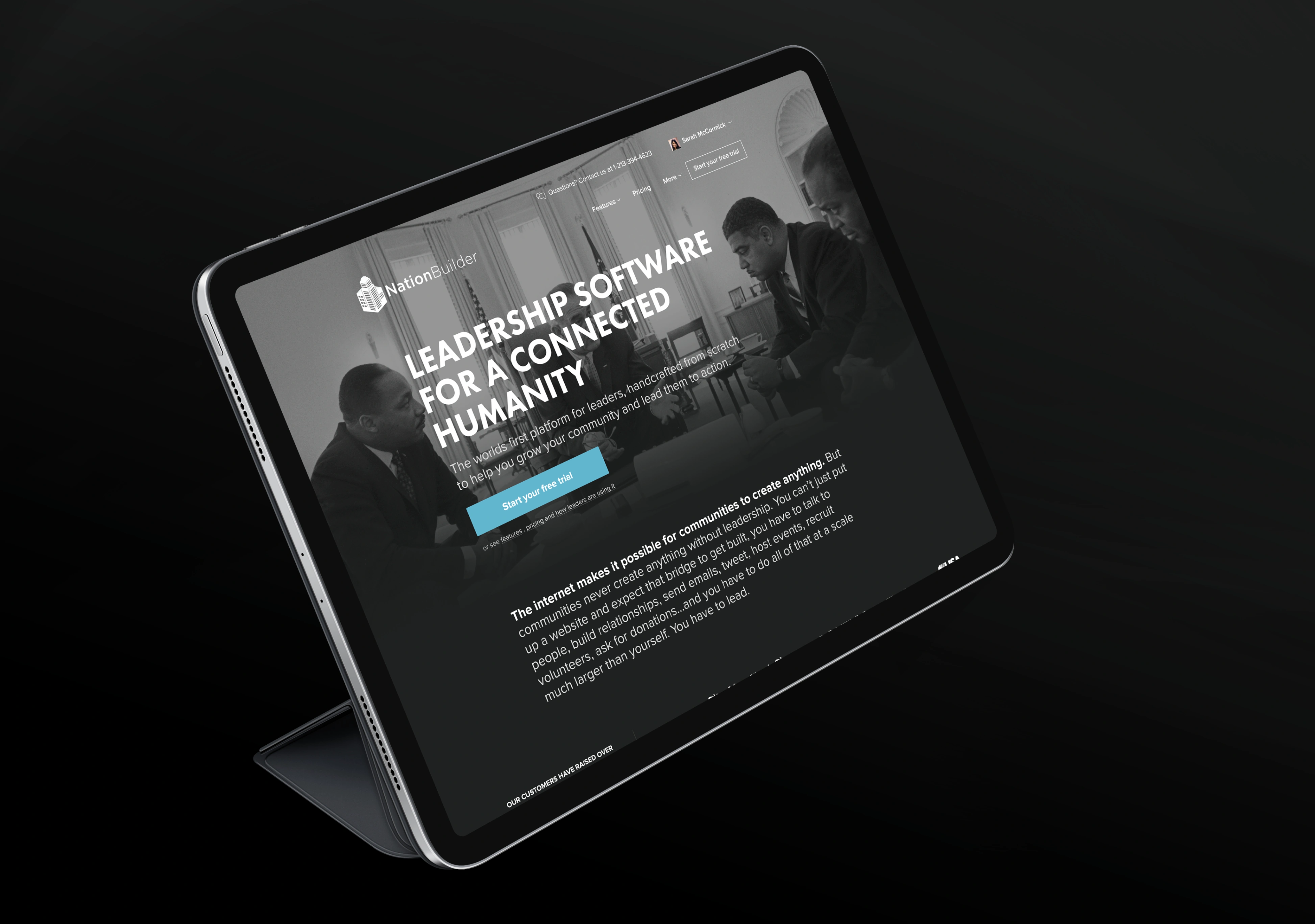
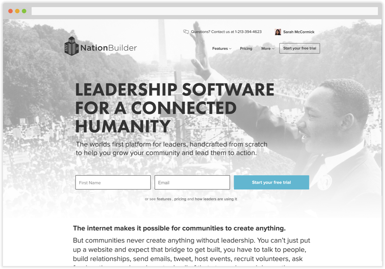
Pages with a job to do
NationBuilder came in with a clear problem: specific pages in their funnel weren't performing the way the platform deserved. The first step wasn't opening a design file — it was getting precise about which pages mattered most commercially and what each one needed to accomplish for a reader landing on it cold.
Part 02
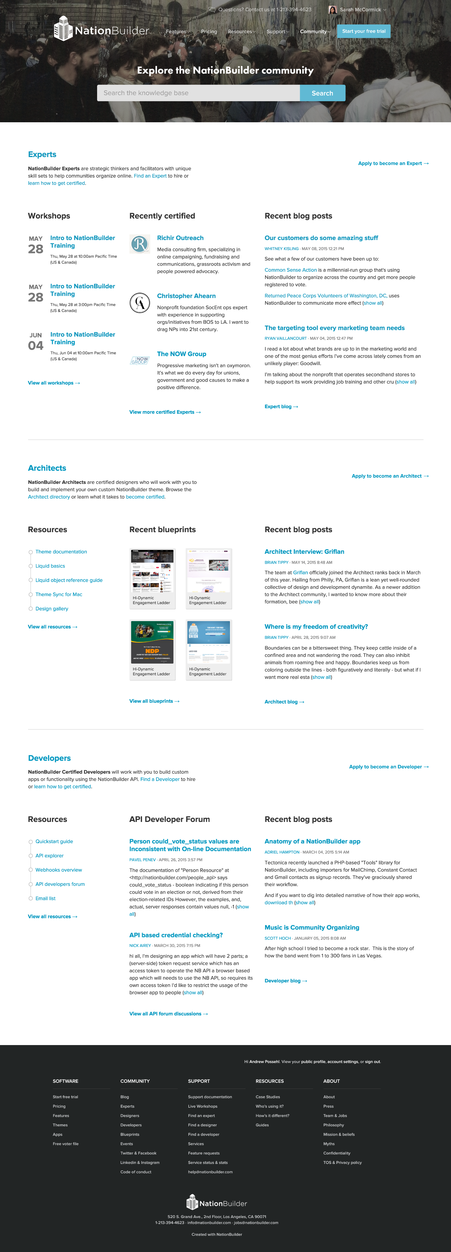
Mapping the audience split
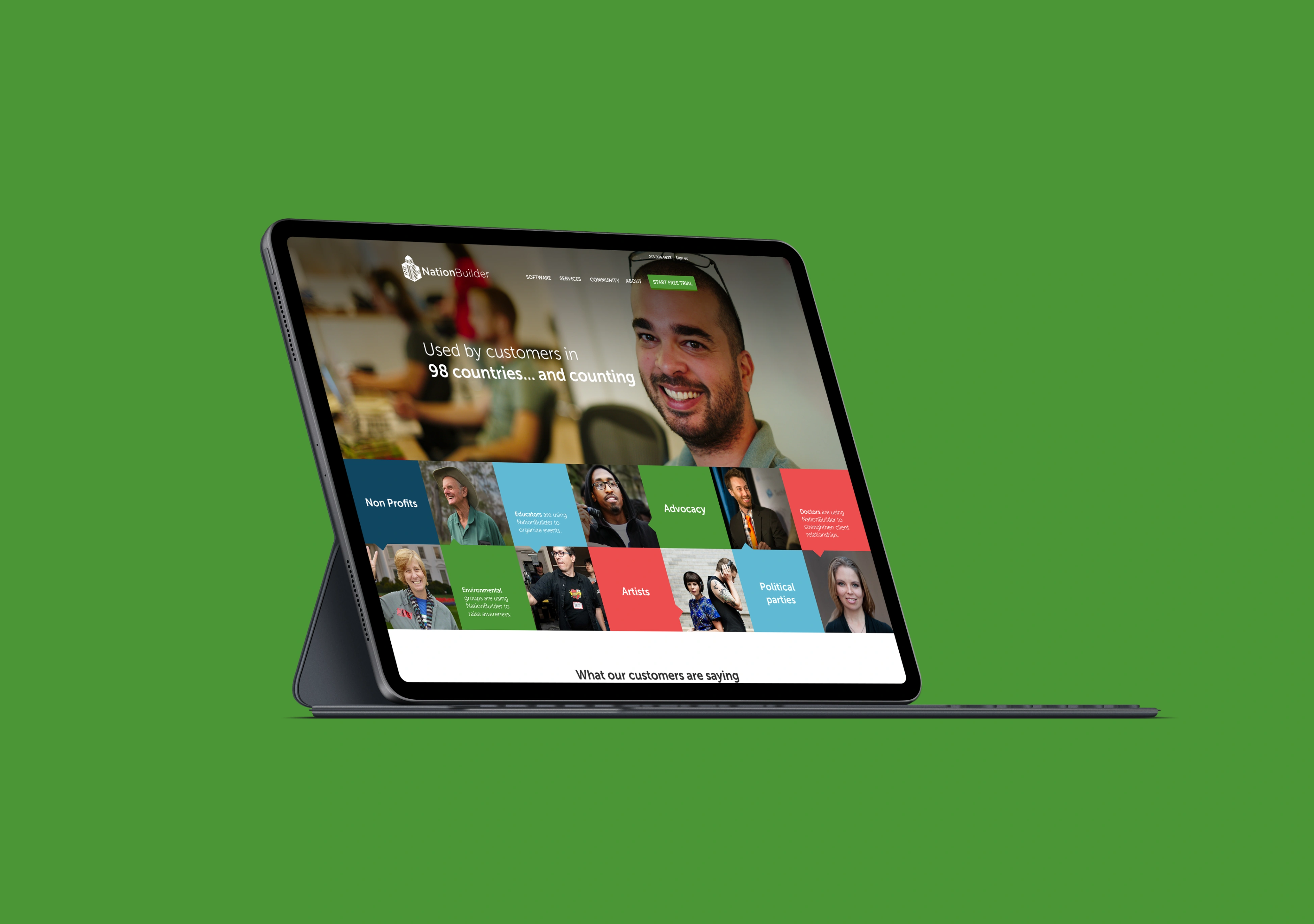
NationBuilder serves three meaningfully different buyer types — nonprofits, campaigns, and advocacy orgs — and each one reads a page differently. The strategy phase mapped out what each segment already believed when they arrived, what objection they were most likely carrying, and what a convincing page needed to address first. That audience map became the backbone of every design decision.
Part 03
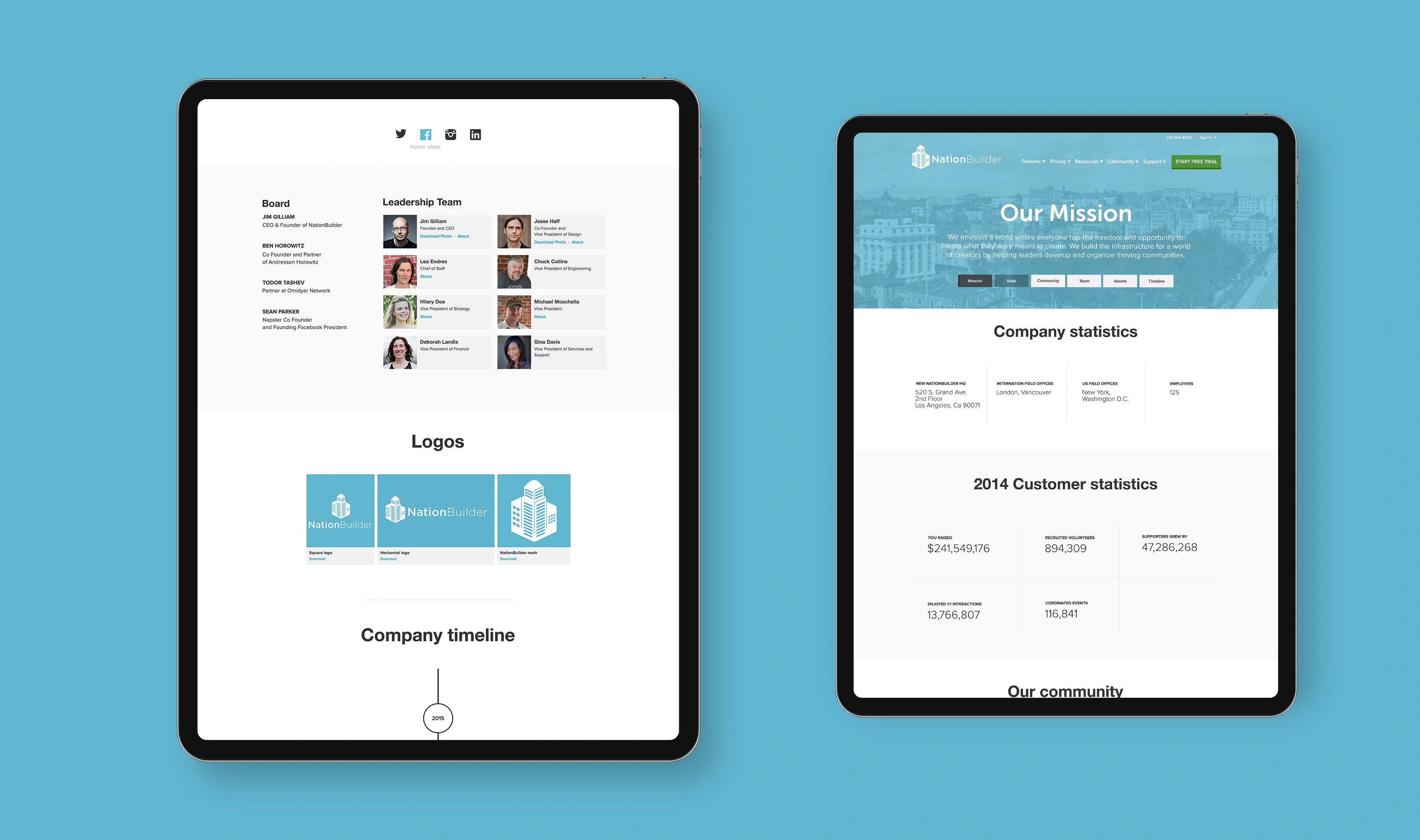
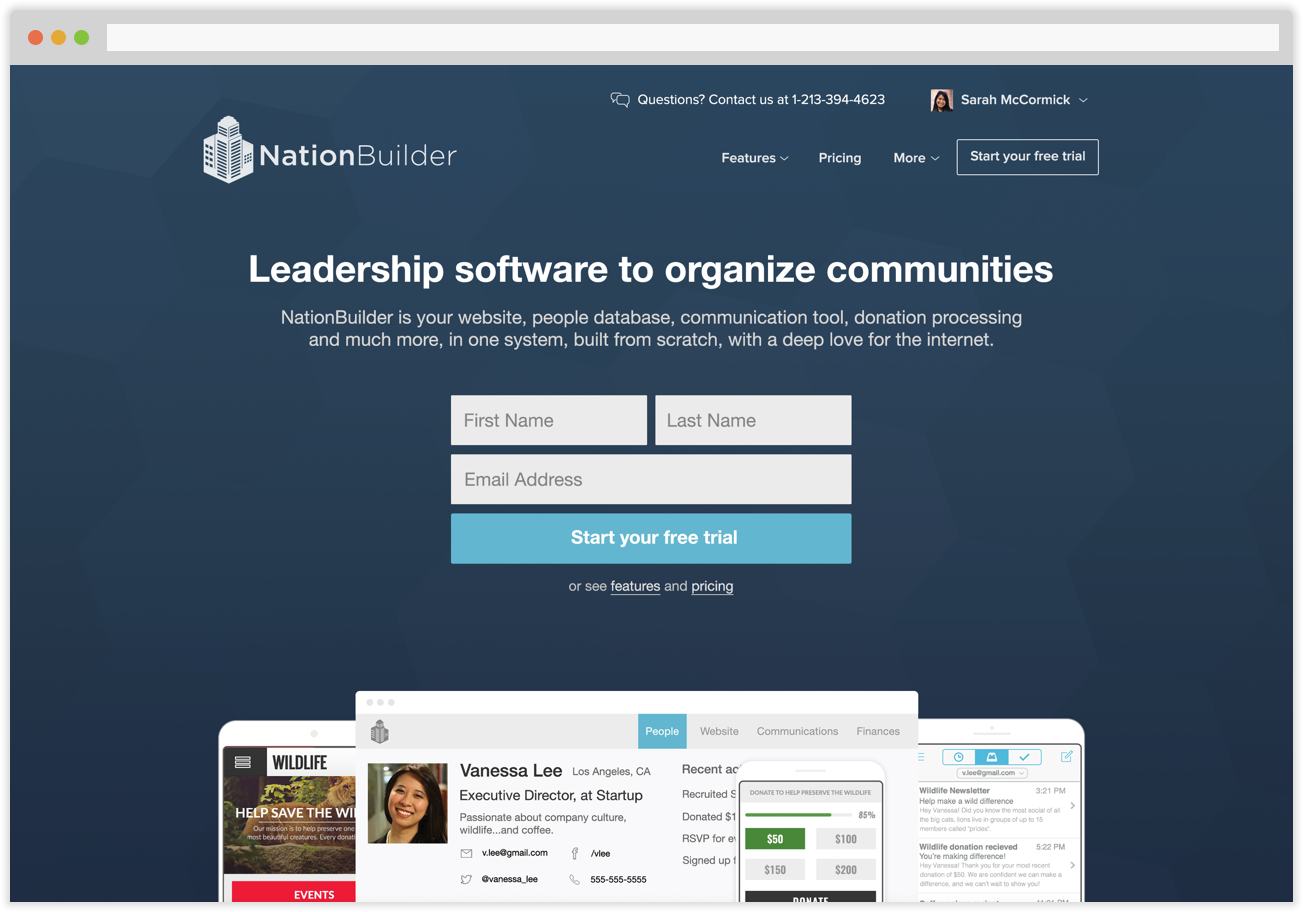
Structure before style
The core design problem on each page wasn't aesthetic — it was hierarchy. Value propositions were buried, sections competed for attention, and calls to action were undersupported. The first design pass on each page was a structural reorder: what needs to be above the fold, what earns the second scroll, what can be cut entirely.
Part 04
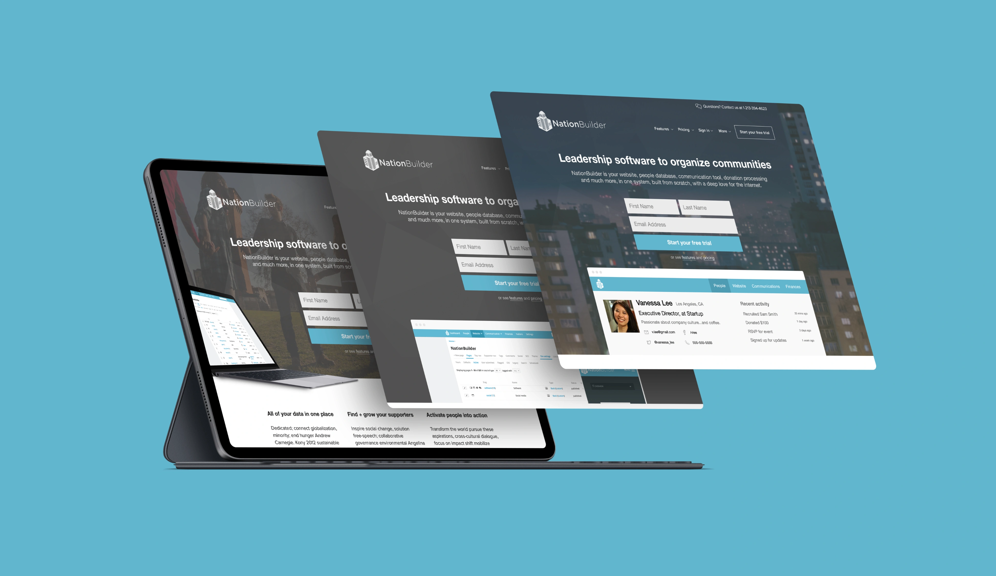
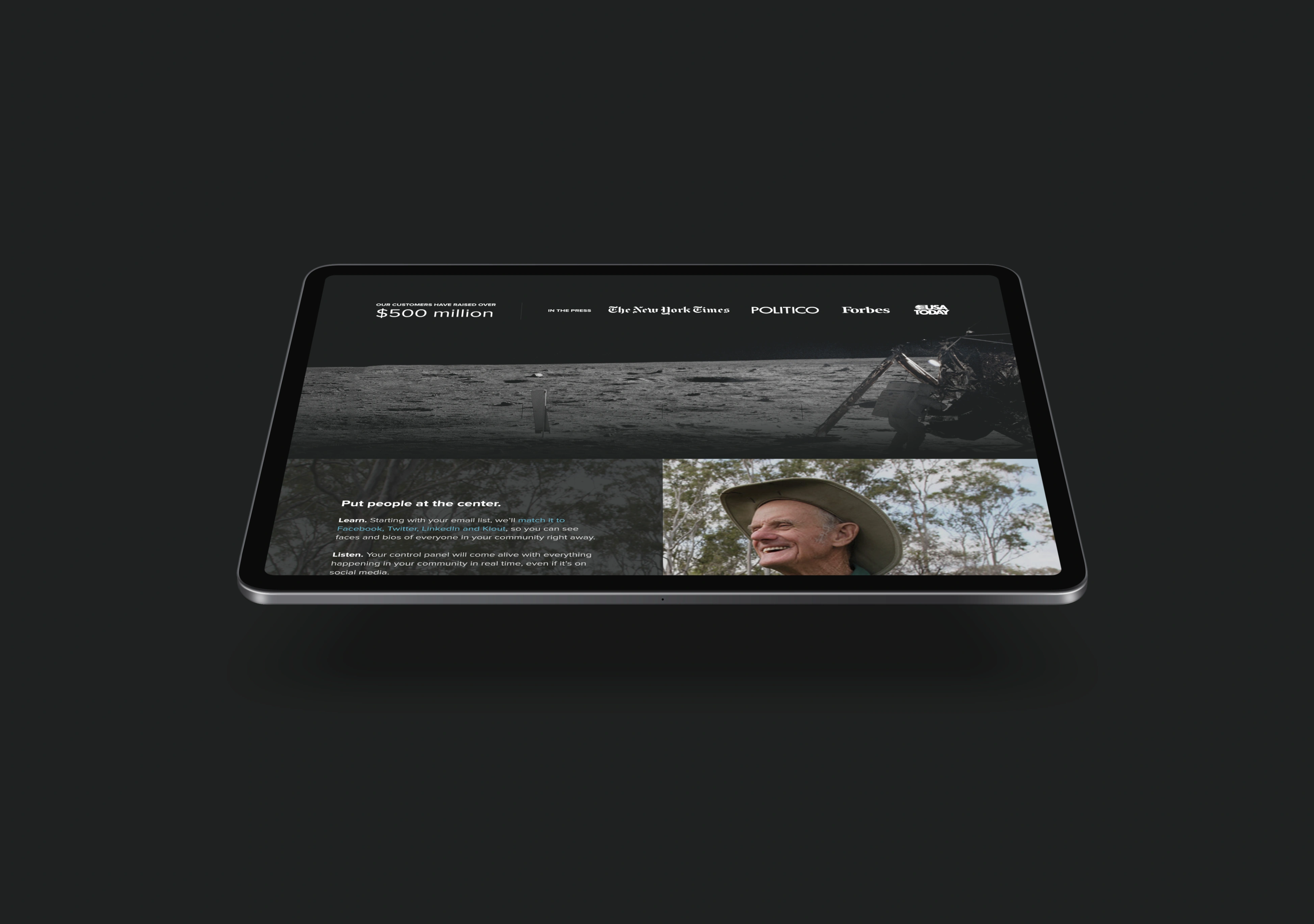
Staying inside the system
The decision was made early to work within NationBuilder's established visual language rather than introduce new directions. Introducing a new palette or type system on a handful of pages would have created dissonance across the broader site. The creative work went into layout, hierarchy, and content pacing — places where the existing design had real room to improve.
Part 05
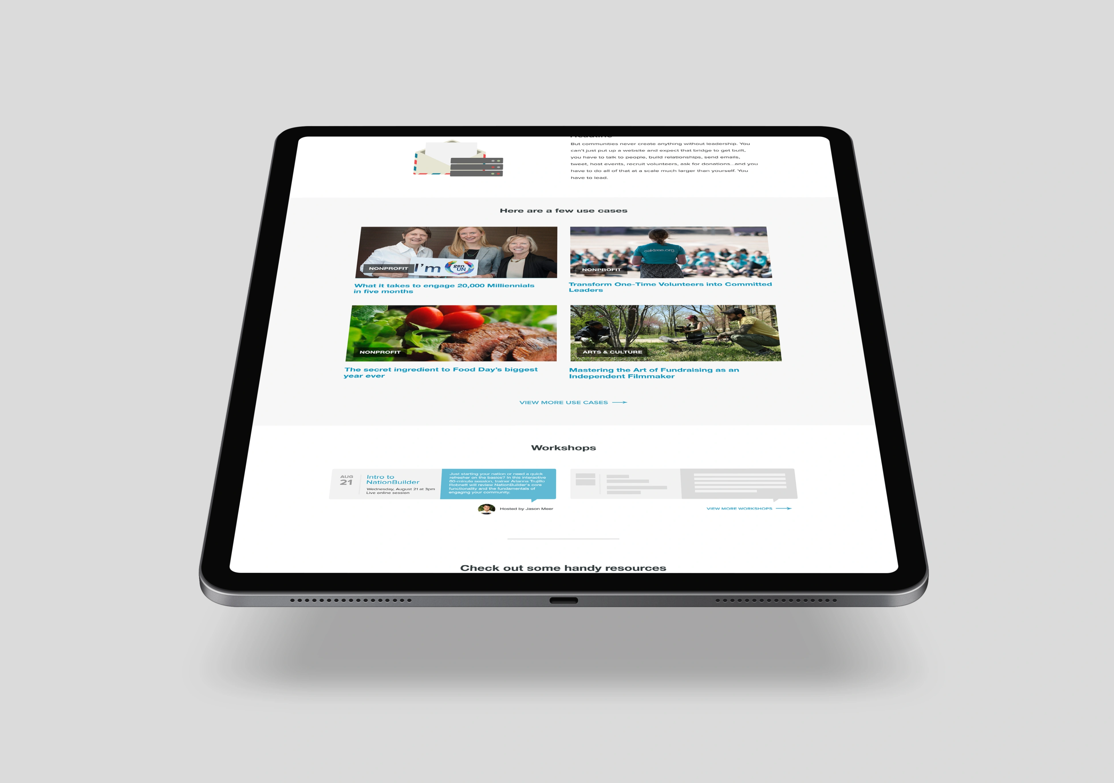
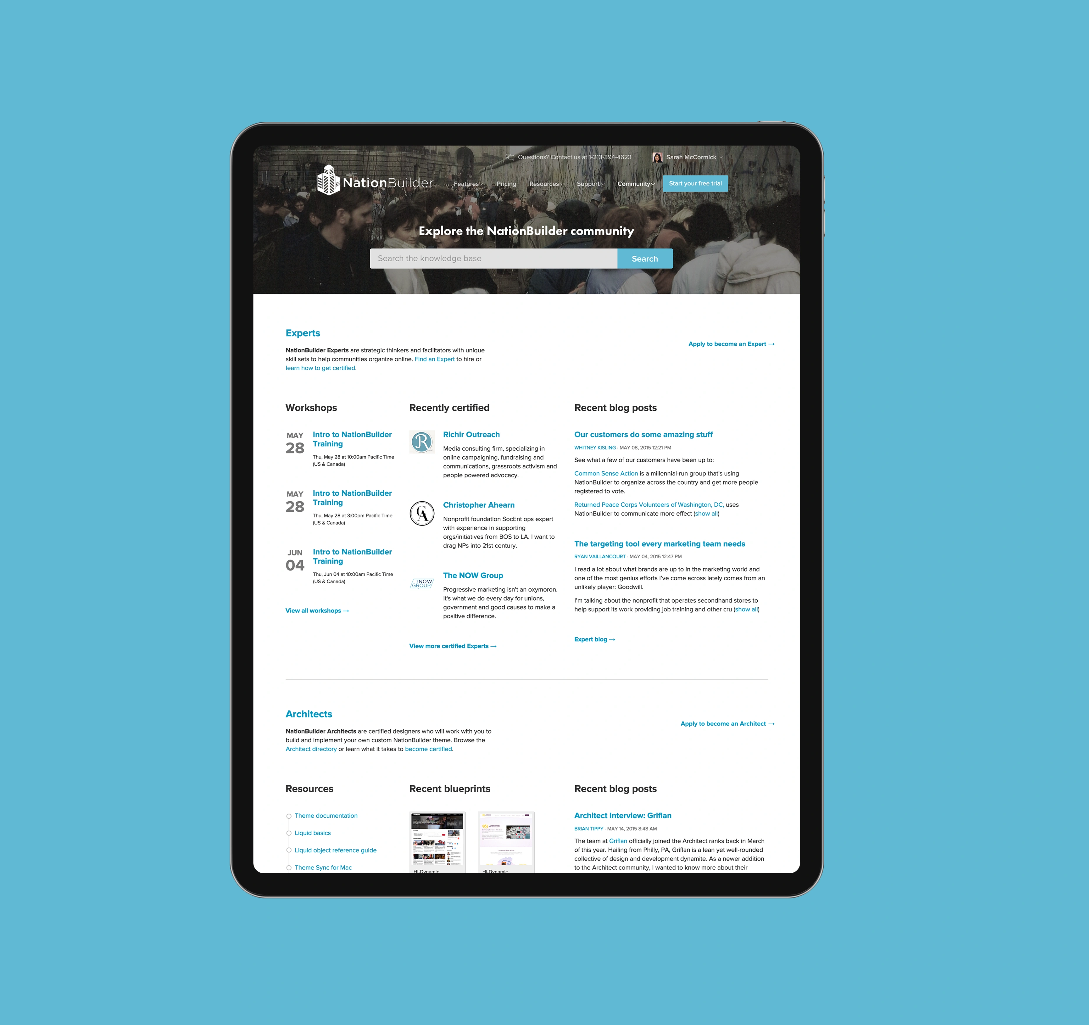
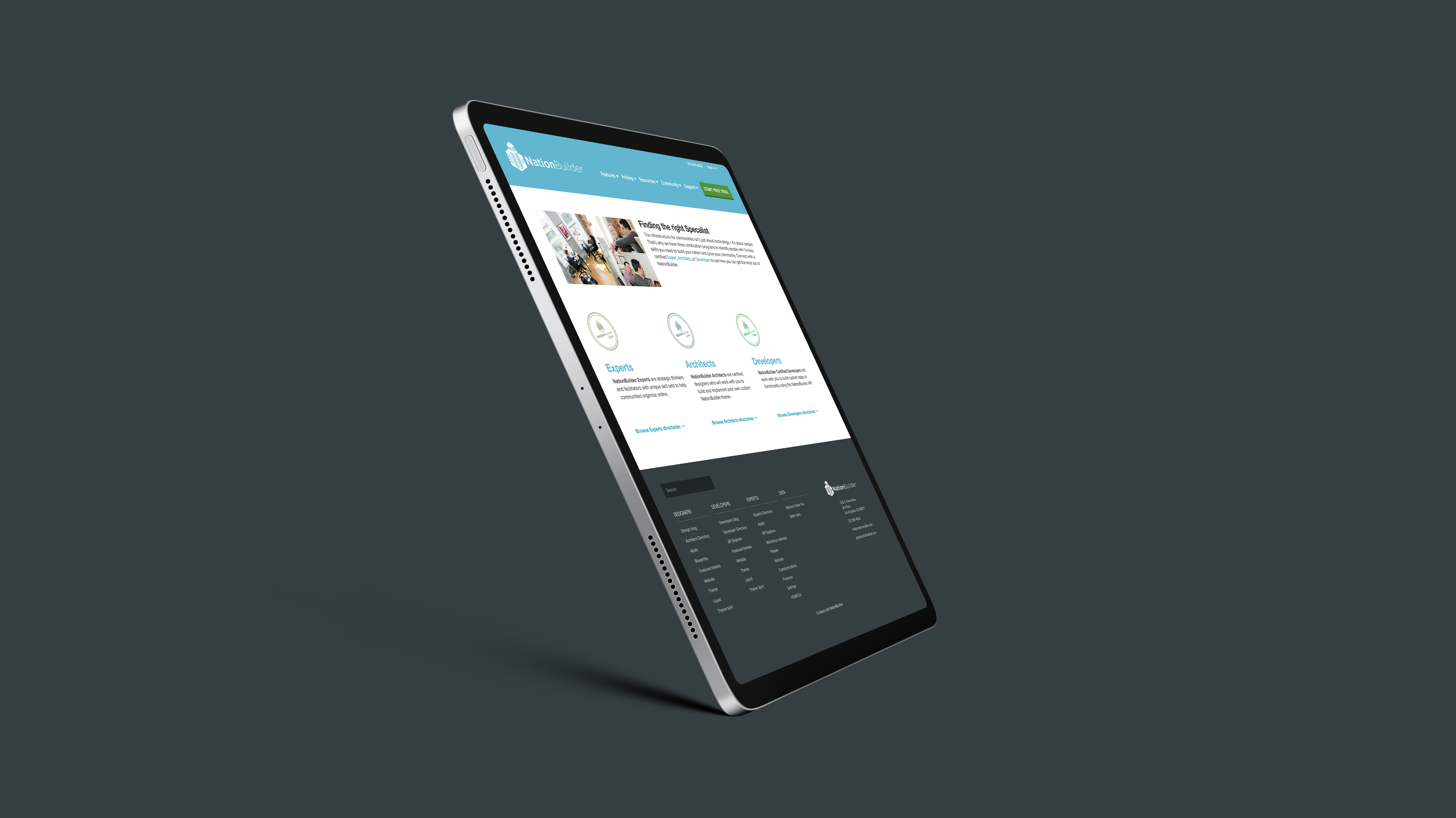
Making the case for each segment
Each page was treated as a standalone UX problem. A nonprofit director scanning for proof of peer adoption reads a page differently than a campaign manager evaluating tooling for an upcoming election cycle. Section content, social proof placement, and CTA framing were all tuned per audience rather than applied as a uniform template.
Part 06
CTA placement as an argument
Where a call to action appears on a page isn't arbitrary — it's a bet on when a reader has enough information to act. On each of these pages, CTA positioning was treated as a design decision with strategic reasoning behind it: appearing too early undermines trust, too late loses the reader who was already convinced.
Part 07
Production-ready handoff
The designs went to development directly — no intermediate production pass needed. Component specs, responsive behavior notes, and content guidelines were built into the deliverables, so the gap between design intent and built output stayed tight.
Part 08
The commercial case for good pages
For a SaaS company where demo bookings and trial starts are the primary pipeline drivers, these pages sit at the highest-leverage point in the funnel. Better hierarchy, cleaner arguments, and more direct paths to conversion have a direct line to business outcomes — which is why the work was treated as critical, not cosmetic.
More from the work

Next Project
No Guarantees Theatrical Productions