Spin
Building design credibility for seventy cities at once
Client

Spin
Role
Embedded Design Leadership & Execution Partner
Timeline
Multi-year engagement
Scope
Tech Stack
The Brief
When the work began, Spin had momentum but not a design foundation. The existing brand was underspecified — a palette and a logo without the system depth needed to scale across a national footprint of cities, campuses, physical hardware, and digital products simultaneously. The website was built in Bootstrap-era Webflow, functional but not built to the standard of a company asking municipalities to trust it with public right-of-way. The mobile app had the bones of a working product, but lacked the visual language and UX consistency to stand next to well-funded competitors in the App Store. There was no internal design infrastructure — no shared component library, no documented token system — which meant every new surface required starting from scratch. The inflection point was scale. Spin was expanding city contracts and campus partnerships faster than the design function could support. A template shop or a single contractor couldn't cover the simultaneous demands: a rebrand that worked on a scooter fender and a city partnership proposal, an app redesign that had to ship without disrupting an active rider base, and a website that needed to serve two fundamentally different audiences — riders downloading the app and city officials evaluating a vendor. Boneyard's profile fit the need: a senior team that could hold design strategy and pixel-level execution in the same conversation, move fast inside a high-growth startup, and build the systems that would let Spin's internal team own the work long-term.
What we did
The core decision early on was to treat brand, product, and web as a single interconnected system rather than three parallel workstreams. That meant the brand identity work wasn't finished before the app design started — they were developed in dialogue, so the visual language that emerged from the brand had real product constraints baked in from day one. Spin's signature orange was retained and sharpened, but the palette was expanded into a system that could handle data-dense operational screens, marketing hero moments, and municipal-grade communications without visual dissonance. One deliberate tradeoff: the brand leaned into a civic, infrastructure-adjacent tone rather than the playful consumer energy that Bird and Lime were running — because Spin's B2G business required city officials to see a credible institutional partner, not a startup. Execution moved in phases anchored to Spin's growth milestones. The brand identity and design system were established first, providing the foundation everything else was built on. The mobile app was designed and iterated across multiple releases, with particular attention to the core rider flow — finding a scooter, unlocking, ending a ride safely — and to the operational UI that field teams and city partners used to manage deployments. The website was redesigned to serve dual audiences with a clear information hierarchy: riders could get to the app download immediately, while city and campus partners had a substantive, credible path through Spin's operational story. Physical touchpoints — scooter UI, charging station screens — were brought into the same system so the brand read consistently whether a user encountered it on their phone or on the street.
The outcome
The design work gave Spin a coherent, scalable identity at a moment when the company was operating across dozens of markets simultaneously. City partners and campus administrators encountered a consistent, professionally executed brand at every touchpoint — from the initial pitch through daily operations — which directly supported Spin's positioning as the institutional-grade operator in the category. The mobile app shipped with a visual and UX foundation that riders and operations teams could rely on across a rapidly expanding feature set. Internally, the component library and design system meant the team could ship new surfaces — city landing pages, program materials, in-app features — without rebuilding from scratch each time. That operational efficiency mattered at a company growing as fast as Spin was. By the time Spin merged with Bird to become the largest micromobility operator in North America, the design infrastructure built through this engagement was load-bearing: it was the system the expanded team inherited and continued to build on.
Part 01
What we inherited
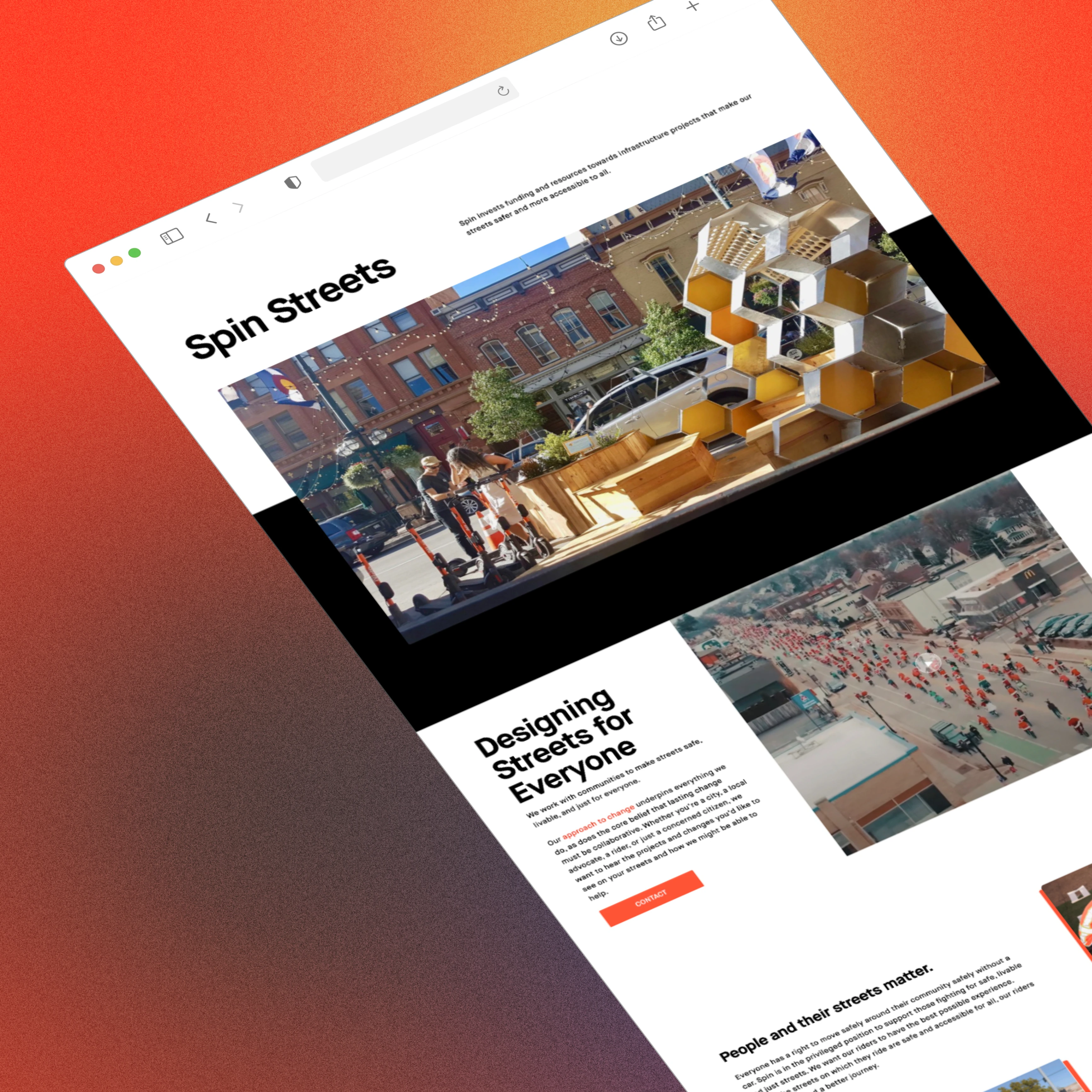
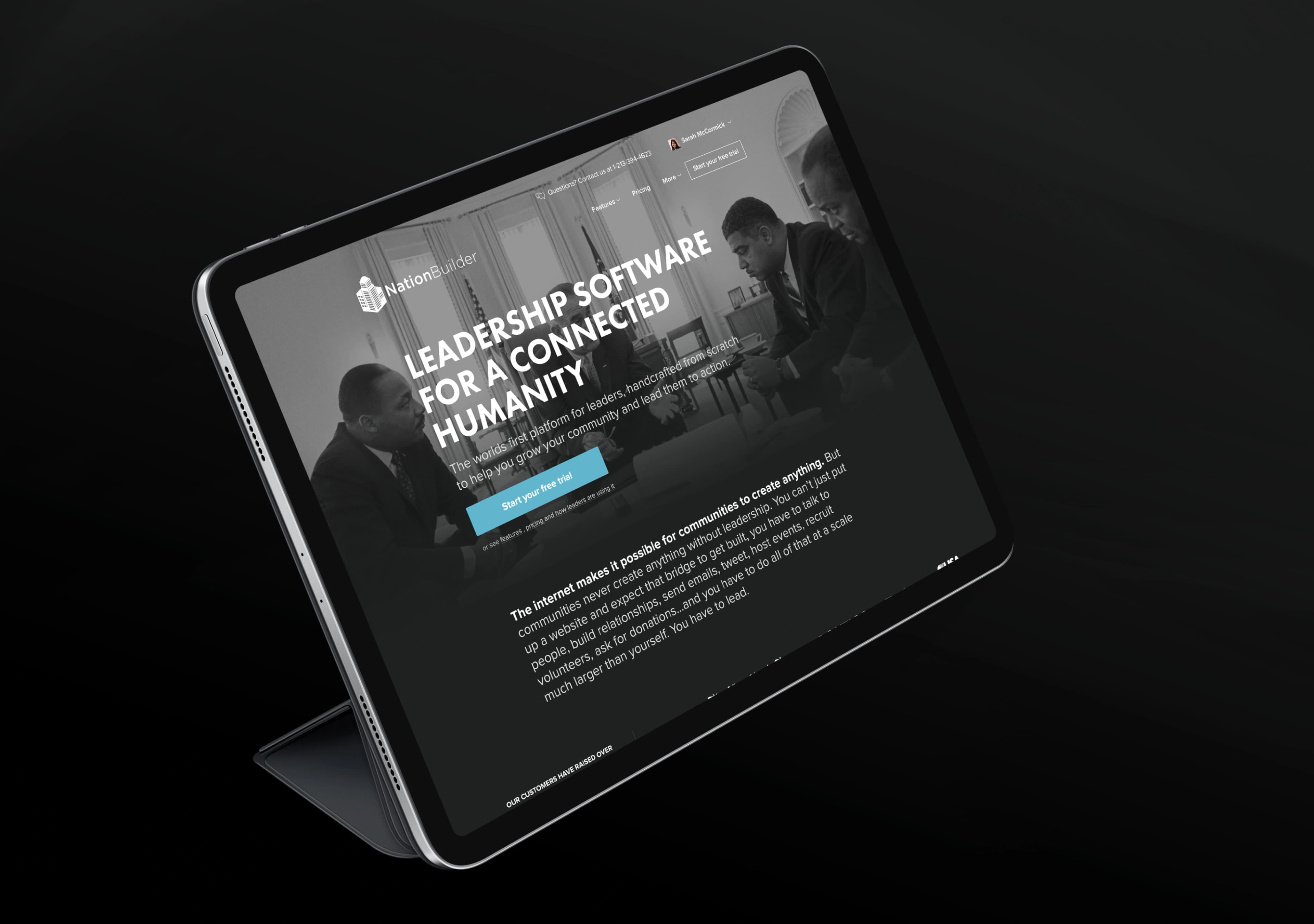
The previous site was a Bootstrap-era Webflow build — functional, but not built to compete. The brand hadn't been systematized beyond a logo and a hex code. There was no component library, no shared token system, no design infrastructure that a growing team could build on. The gap between what Spin was operationally and what its design said about it was real and widening.
Part 02
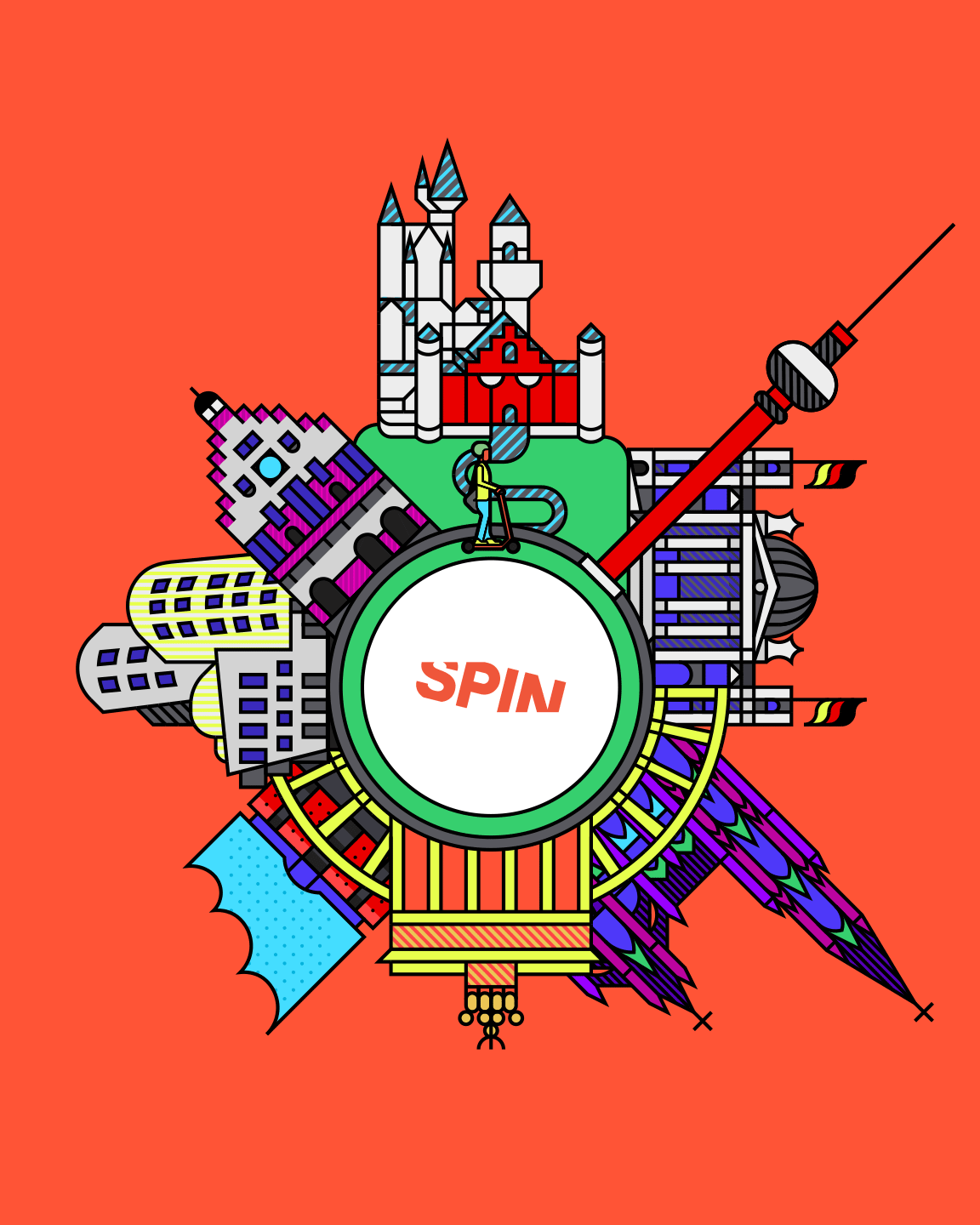
Building the brand system
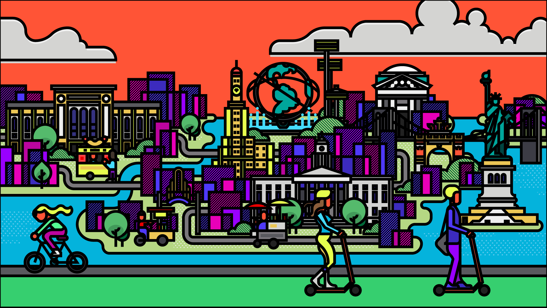
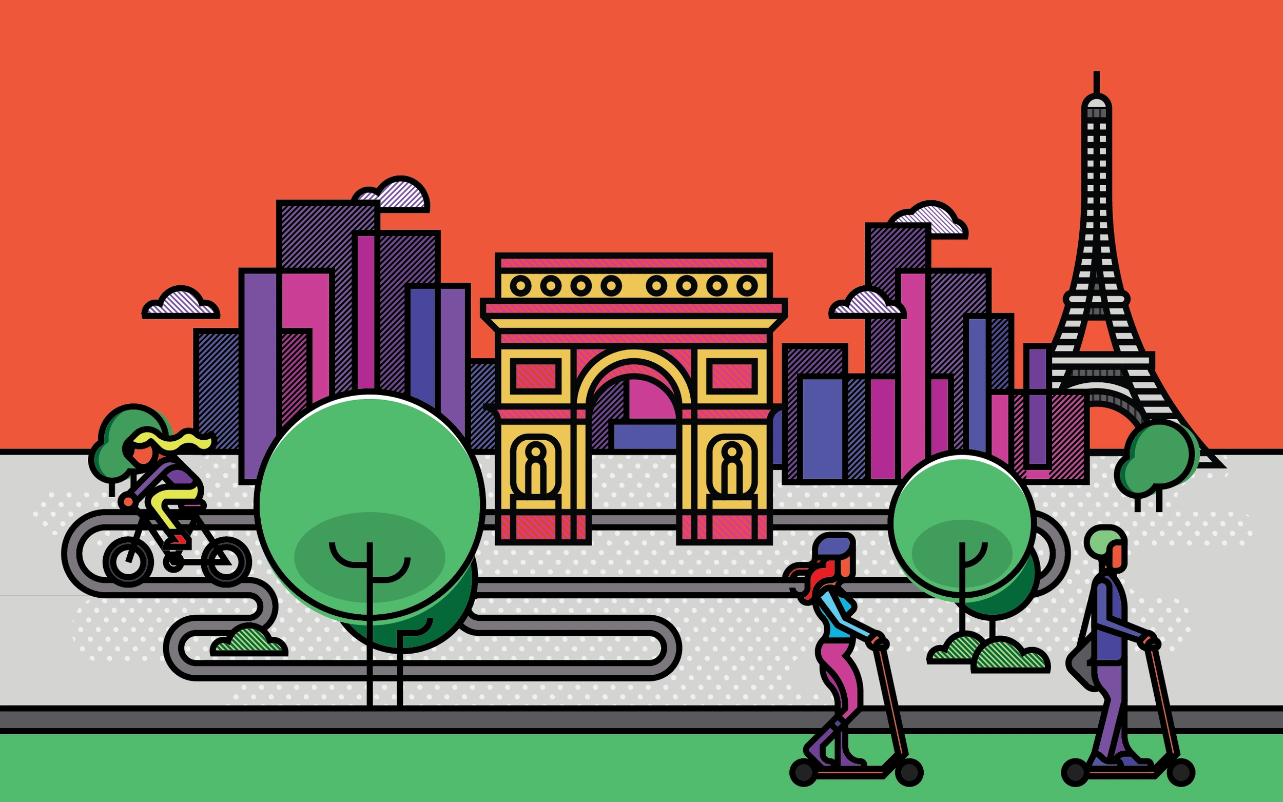
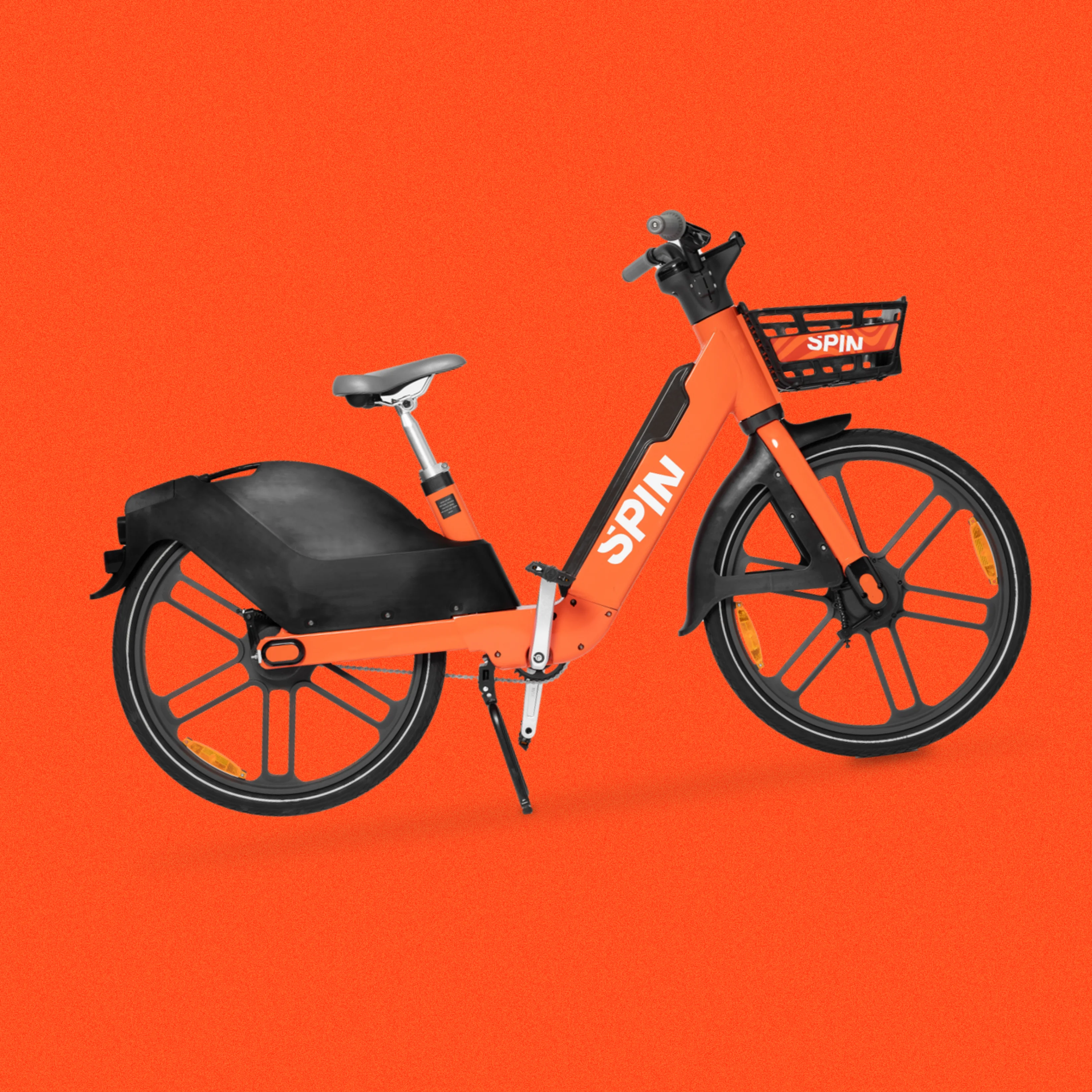
The brand identity work centered on expanding Spin's orange into a full design system — one that could stretch from a scooter fender to a city contract proposal without losing coherence. The tone was deliberately civic and infrastructure-adjacent, not playful-consumer. That was a specific strategic call: Spin's biggest growth lever was municipal partnerships, and city officials needed to see a credible institutional operator, not a startup.
Part 03
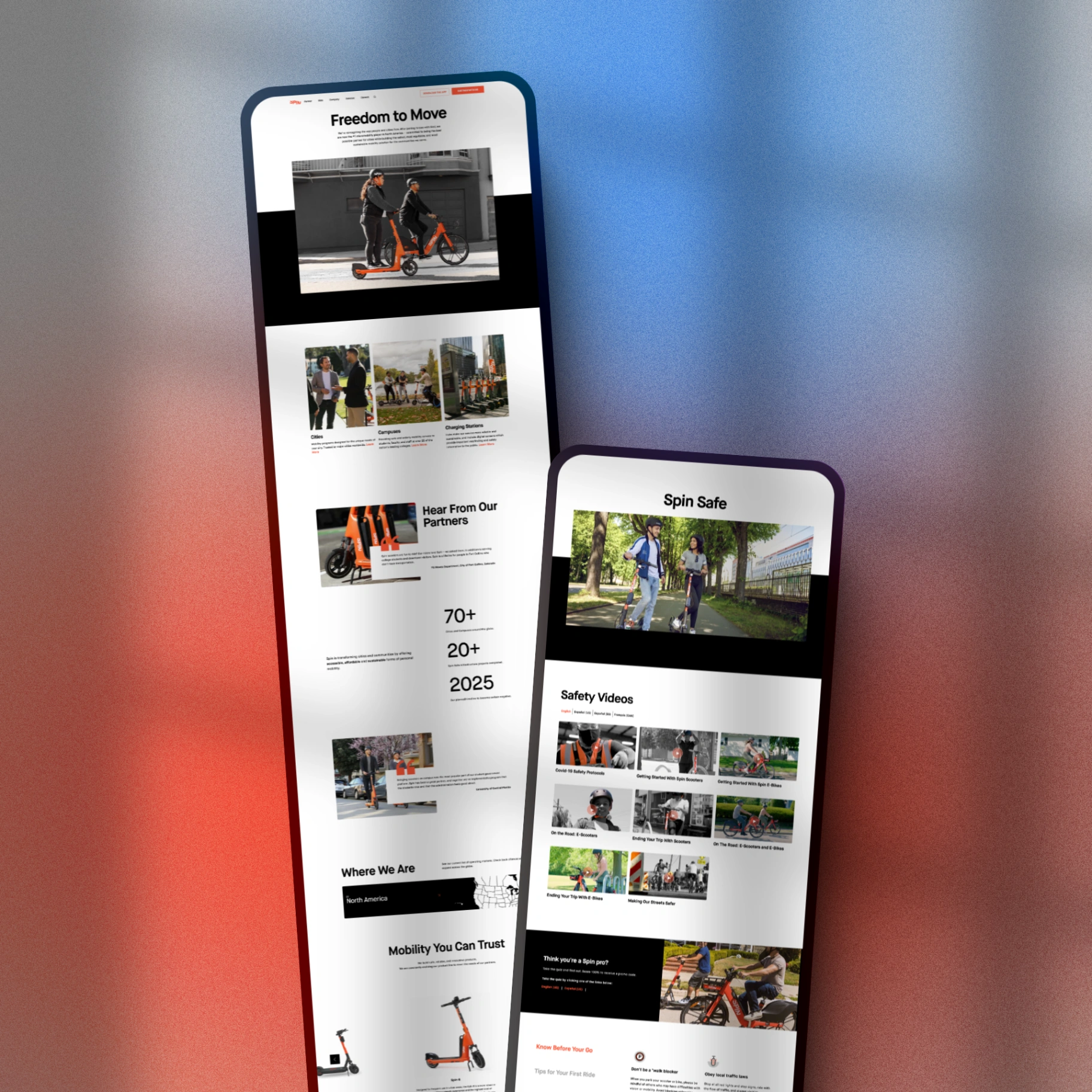
Two audiences, one site
The website redesign had to serve riders and city officials simultaneously — two audiences with completely different intent and information needs. The information architecture was rebuilt so a rider could get to the app download in seconds, while a city or campus partner had a clear, substantive path through Spin's operational story, safety record, and partner testimonials. These paths had to coexist without either feeling like an afterthought.
Part 04
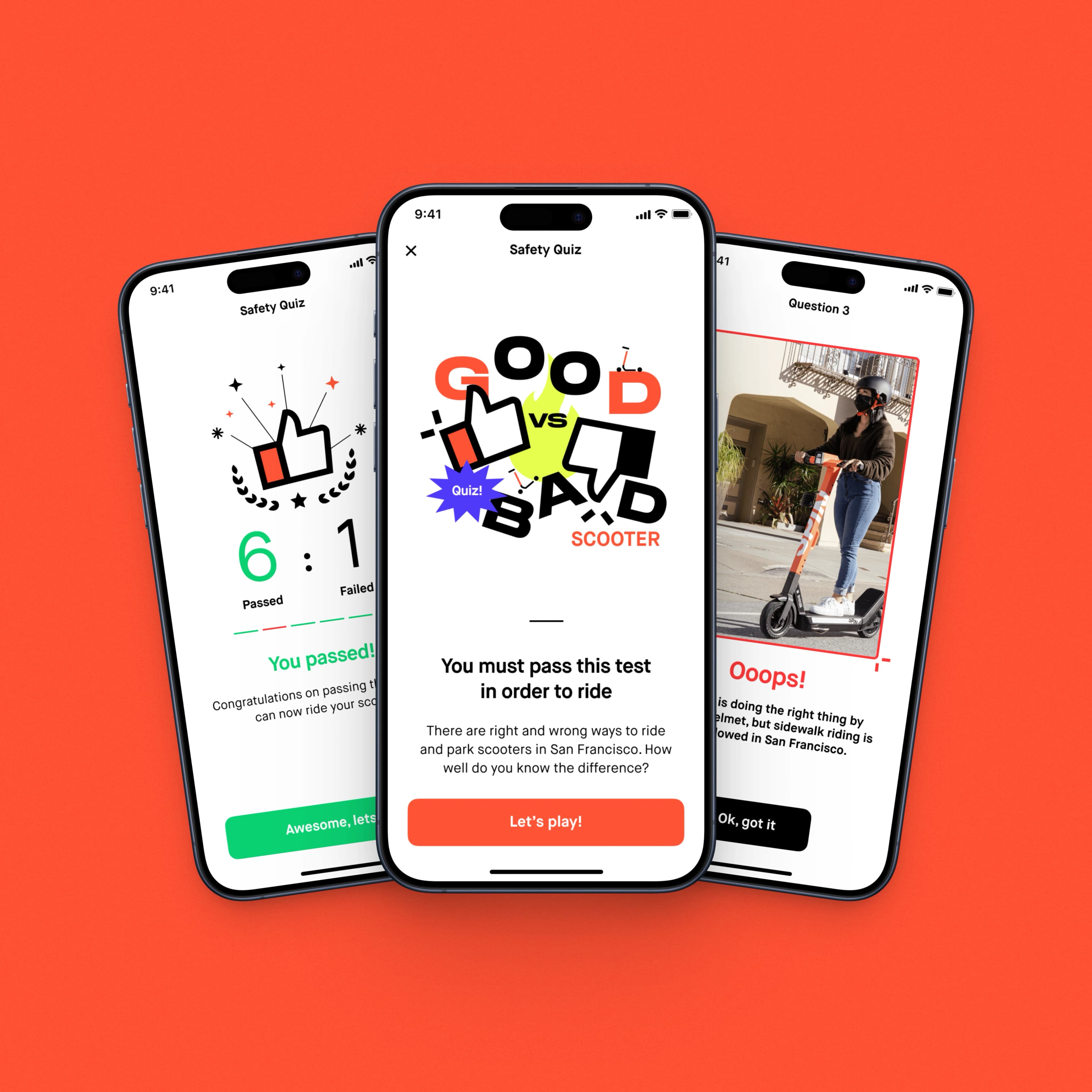
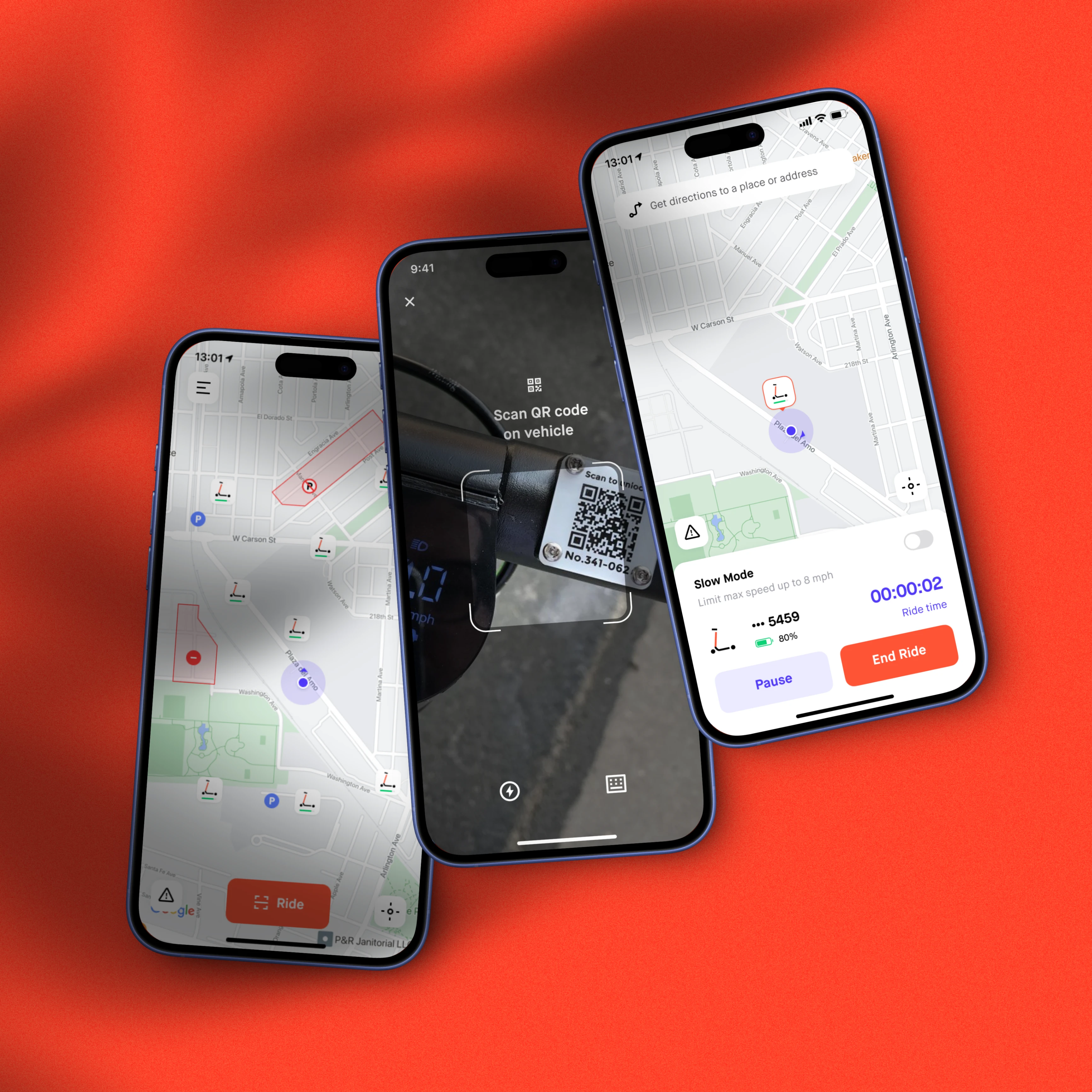
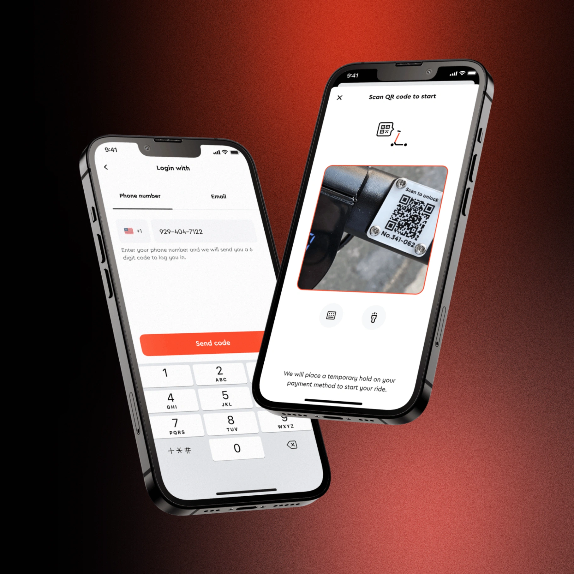
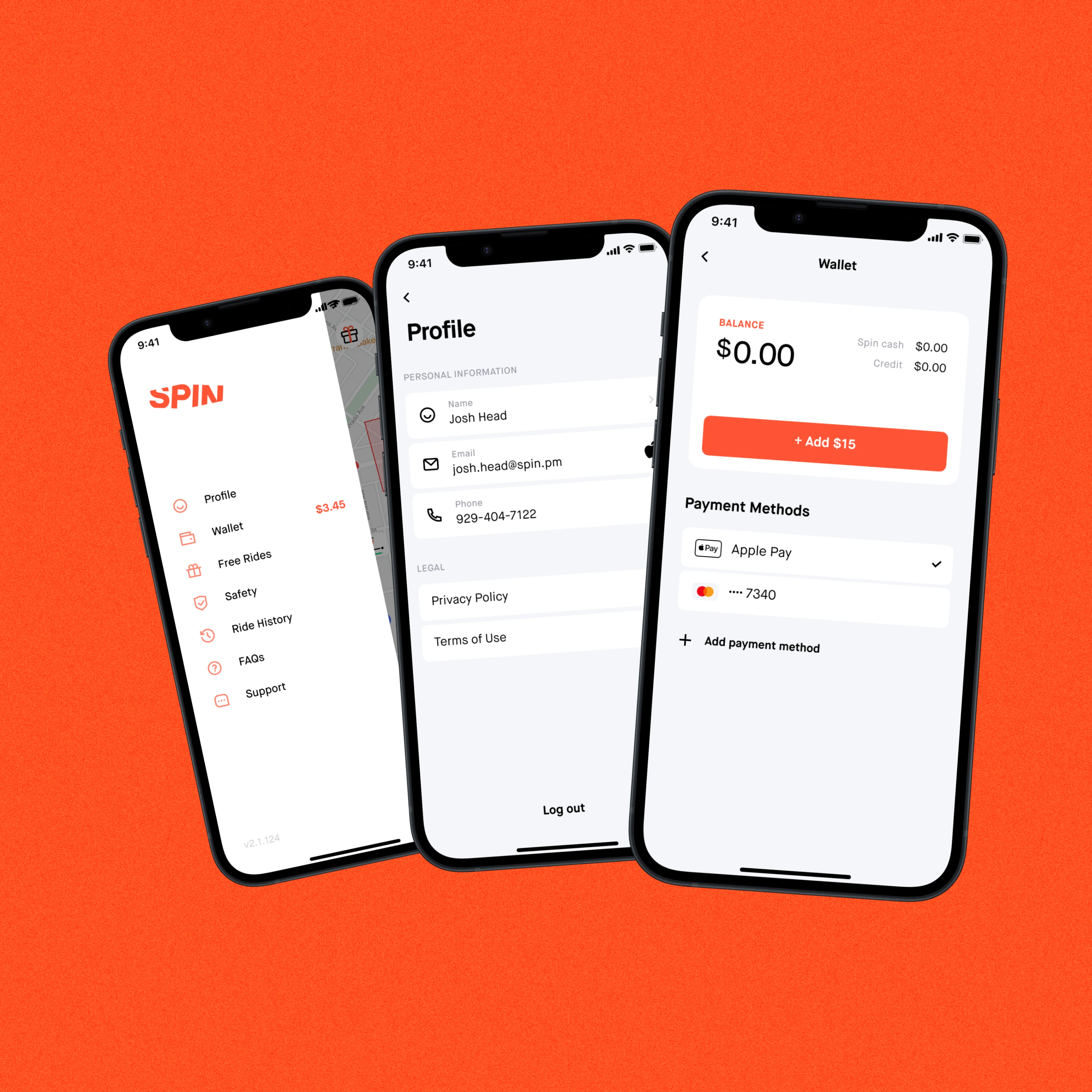
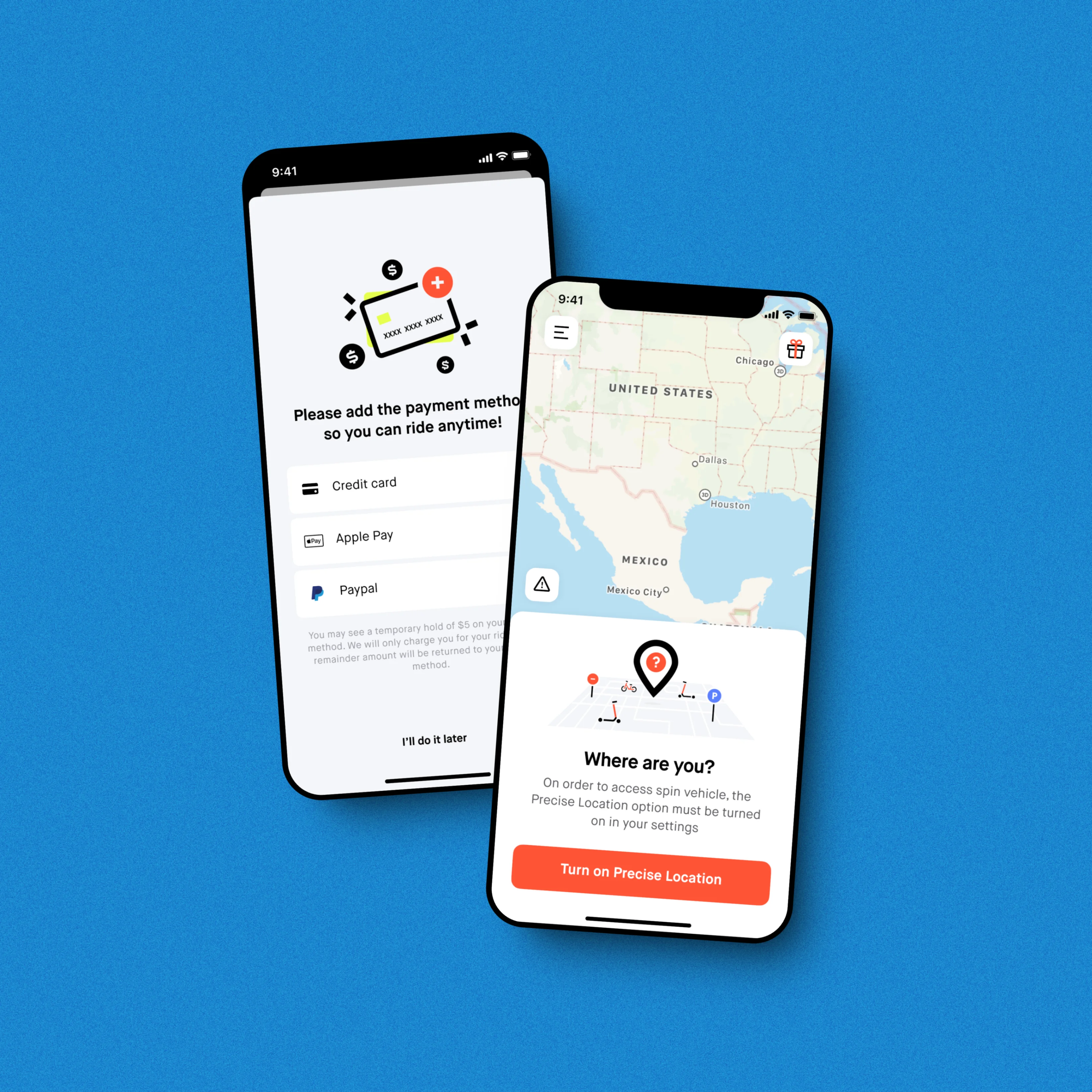
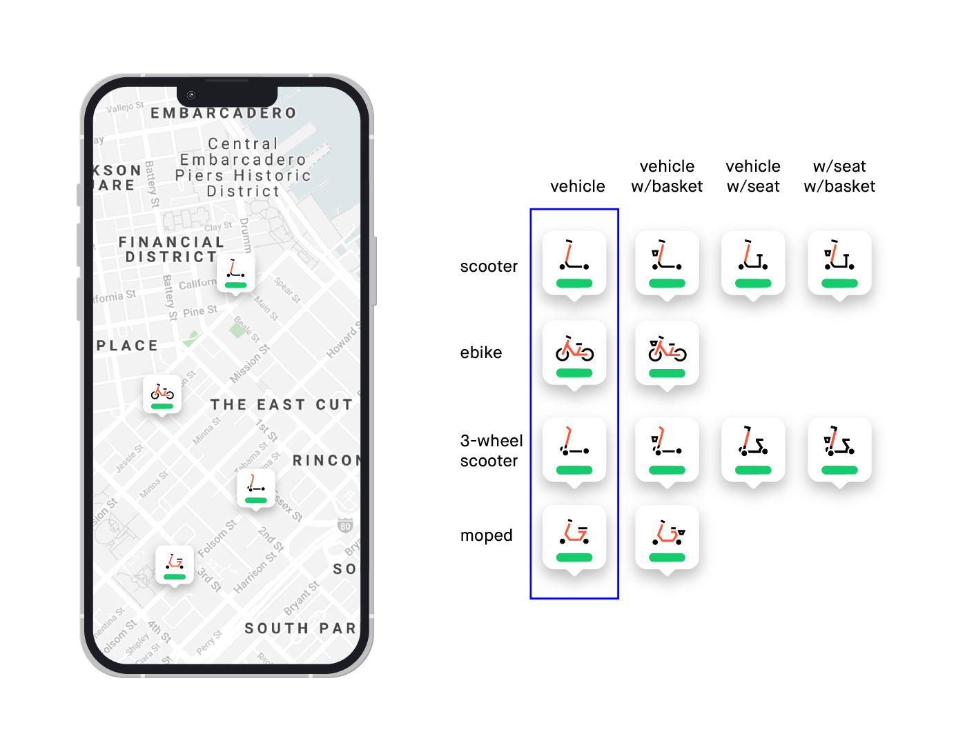
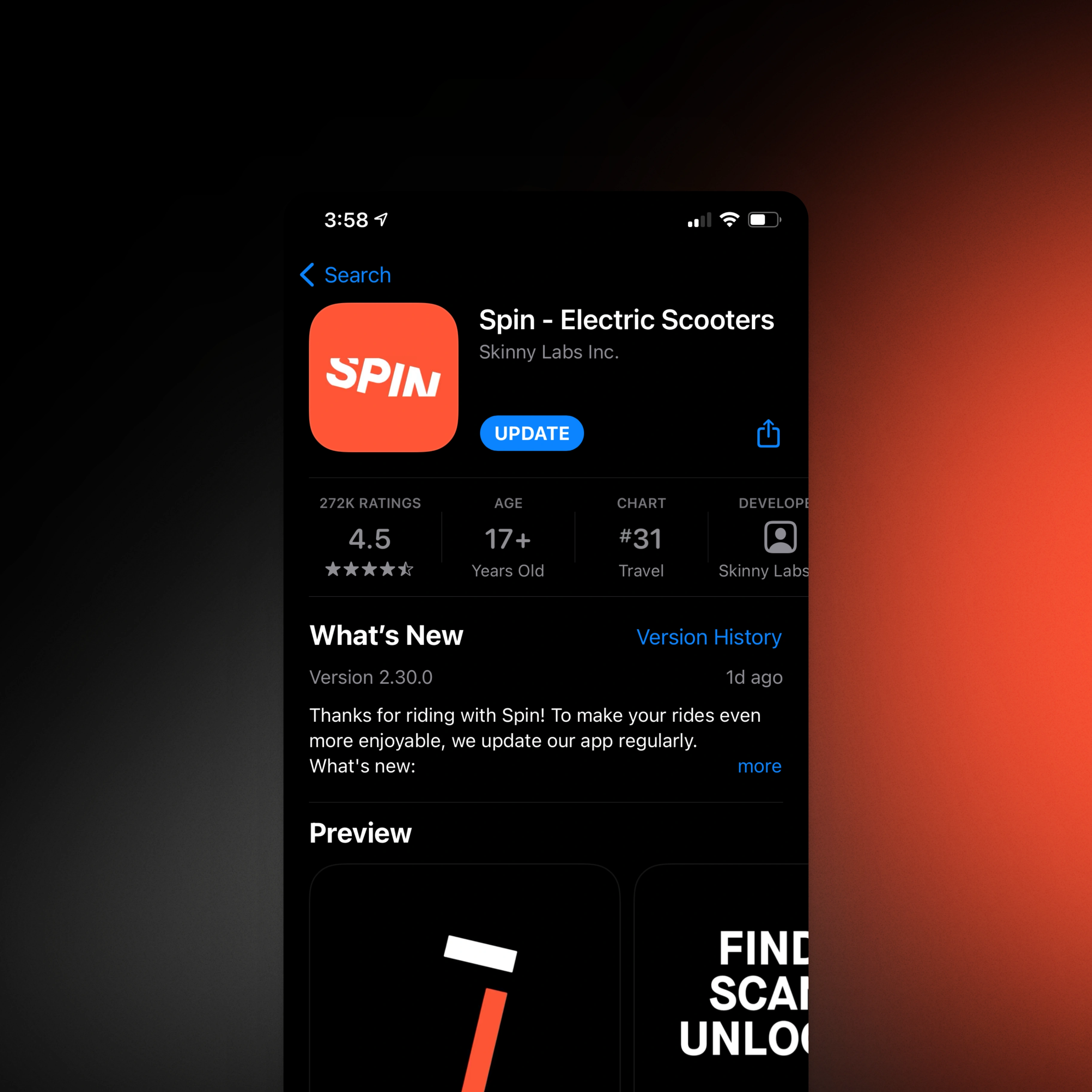
The app's core flow
The consumer mobile app was designed around the critical rider path: find a scooter, unlock it, ride safely, end the trip correctly. Every step in that flow was examined for friction. The visual language established in the brand work carried through into the app UI — the same typographic system, the same color logic — so the product and the brand read as one thing, not two teams working in parallel.
Part 05
Operational screens matter too
Beyond the rider-facing app, Spin's operations teams and city partners used internal tools to manage deployments, track fleets, and monitor compliance. These screens were designed with the same rigor as the consumer product — because how field teams experienced the product directly affected how reliably Spin could deliver on its city contracts.
Part 06
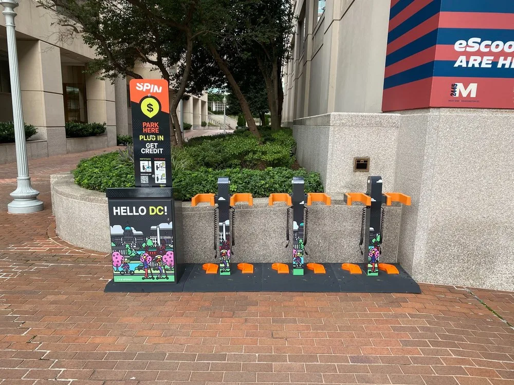
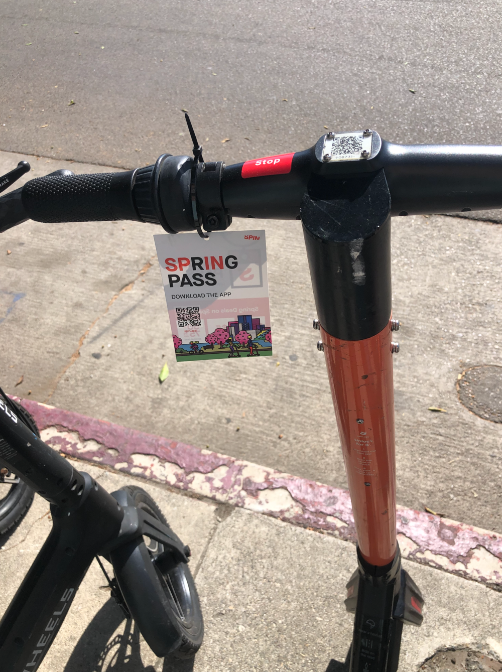
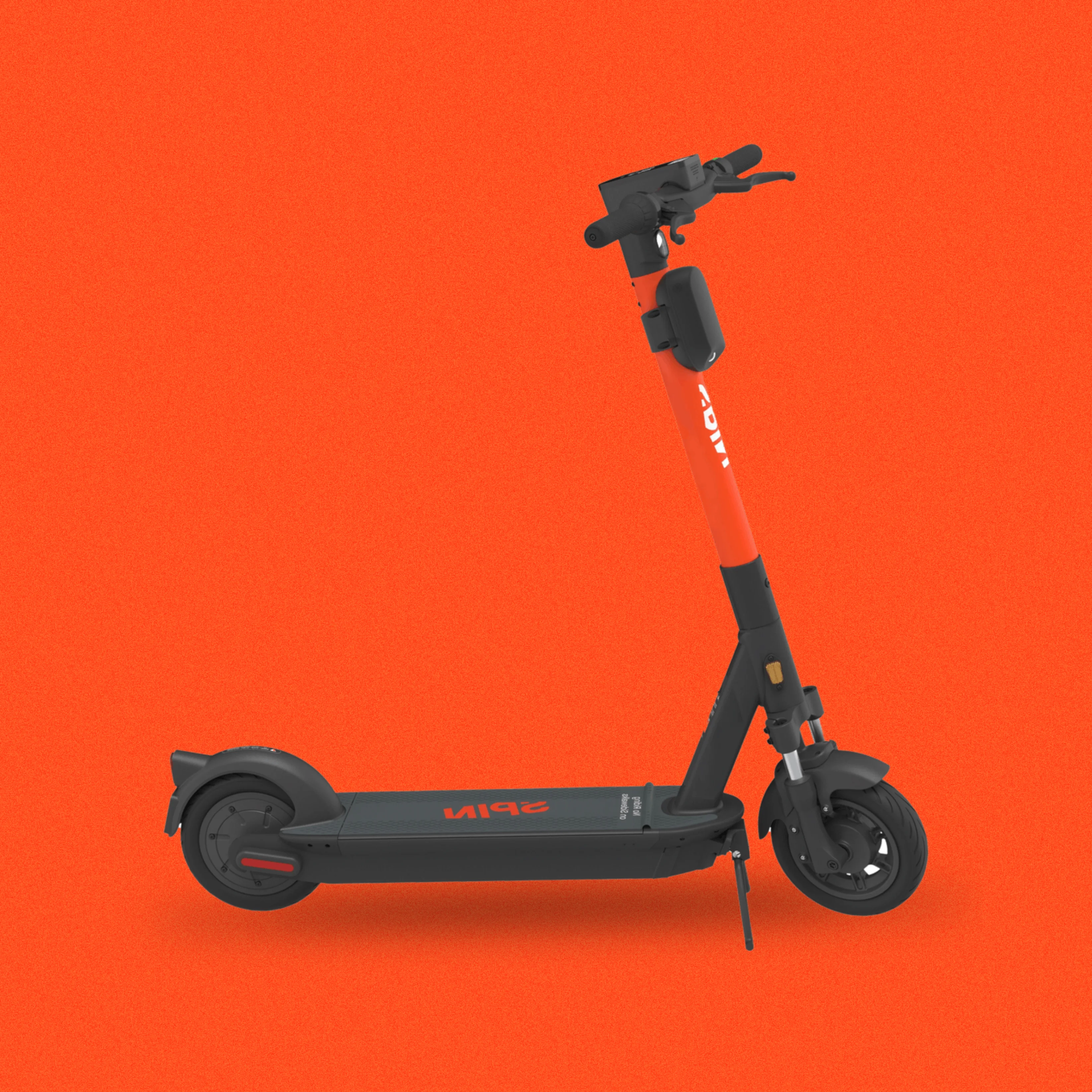
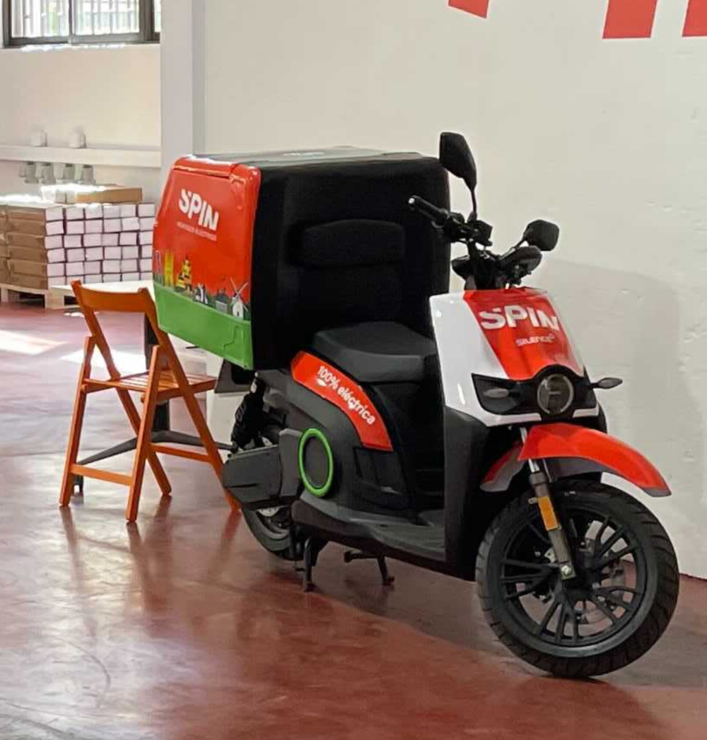
Design that goes physical
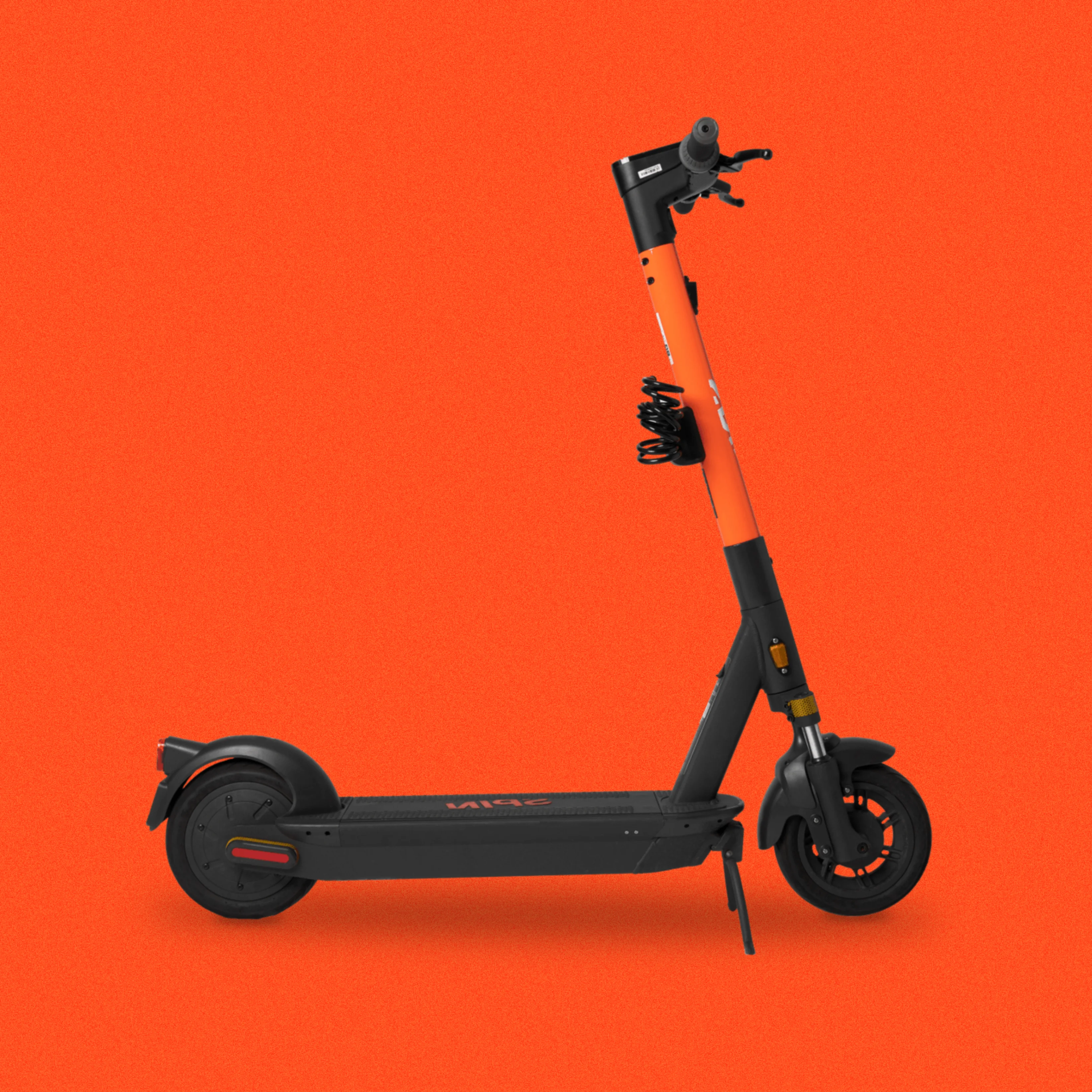
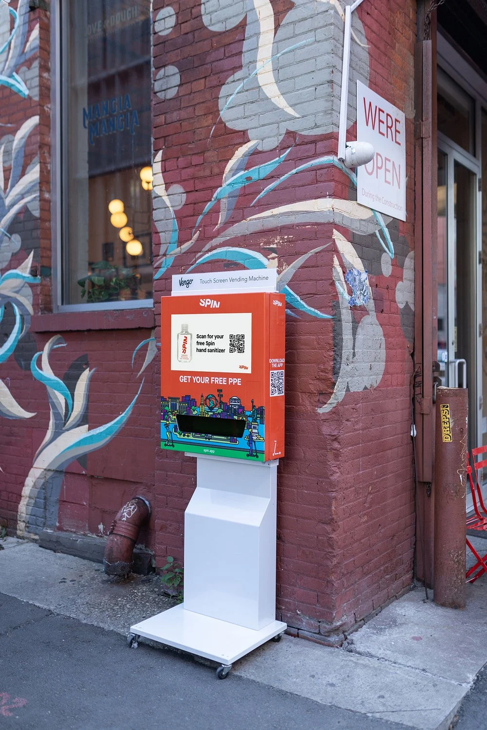
The brand system extended to physical touchpoints: scooter UI screens and public-facing charging station displays. These surfaces had hard constraints — outdoor visibility, limited interaction, public audiences who may never open the app. Bringing them into the same design system meant a rider's first encounter with Spin, whether on a street corner or inside an app, felt like the same company.
Part 07
The system as infrastructure
The component library and token system were built to outlast the initial engagement. City landing pages, program marketing materials, in-app feature additions — all of these could be assembled from shared building blocks rather than rebuilt from scratch. For a company expanding into new markets monthly, that operational efficiency was as important as any single design decision.
Part 08
Scaling the team
As Spin grew, so did the design function supporting it. The systems and standards established early became the onboarding foundation for new designers joining the team, ensuring that output stayed consistent even as headcount and market footprint expanded rapidly across North America.
Part 09
A foundation built to last
When Spin merged with Bird to become the largest micromobility operator in North America, the design infrastructure from this engagement was the system the expanded organization inherited. The brand, the app, the web presence, the component library — all of it transferred cleanly because it was built as a system, not a collection of one-off deliverables.
More from the work

Next Project
Hush, Inc.