
Nav
Turning scattered product features into coherent financial expertise
Client

Nav
Role
Brand Design, Web Design & Frontend Development Partner
Timeline
14 weeks
Scope
Tech Stack
The Brief
When Nav arrived, they had a logo and a color palette — the raw materials of a brand — but no design language connecting them to the product. The existing site was built on Bootstrap with a mix of React and Vue components that had accumulated over years of feature additions. Visually, it read as a collection of independent pages rather than a coherent platform. The typography was inconsistent, spacing was arbitrary, and the component patterns didn't reinforce each other. For a product that asks small business owners to connect their financial accounts and trust Nav with sensitive credit data, that incoherence was a direct conversion problem: the site didn't signal the stability and expertise the product actually delivered. The inflection point was Nav's move to a tiered membership model with Prime. That structural change in how they sold required a site that could clearly articulate three distinct product tiers and the value of each — something the existing layout and visual hierarchy couldn't support. Solving that in-house would have required rebuilding design and frontend infrastructure from scratch while also running the product. Boneyard's profile fit the gap precisely: a small senior team that could hold design system thinking and frontend execution in the same conversation, move fast without a large agency's coordination overhead, and work from an existing brand foundation rather than starting cold.

What we did
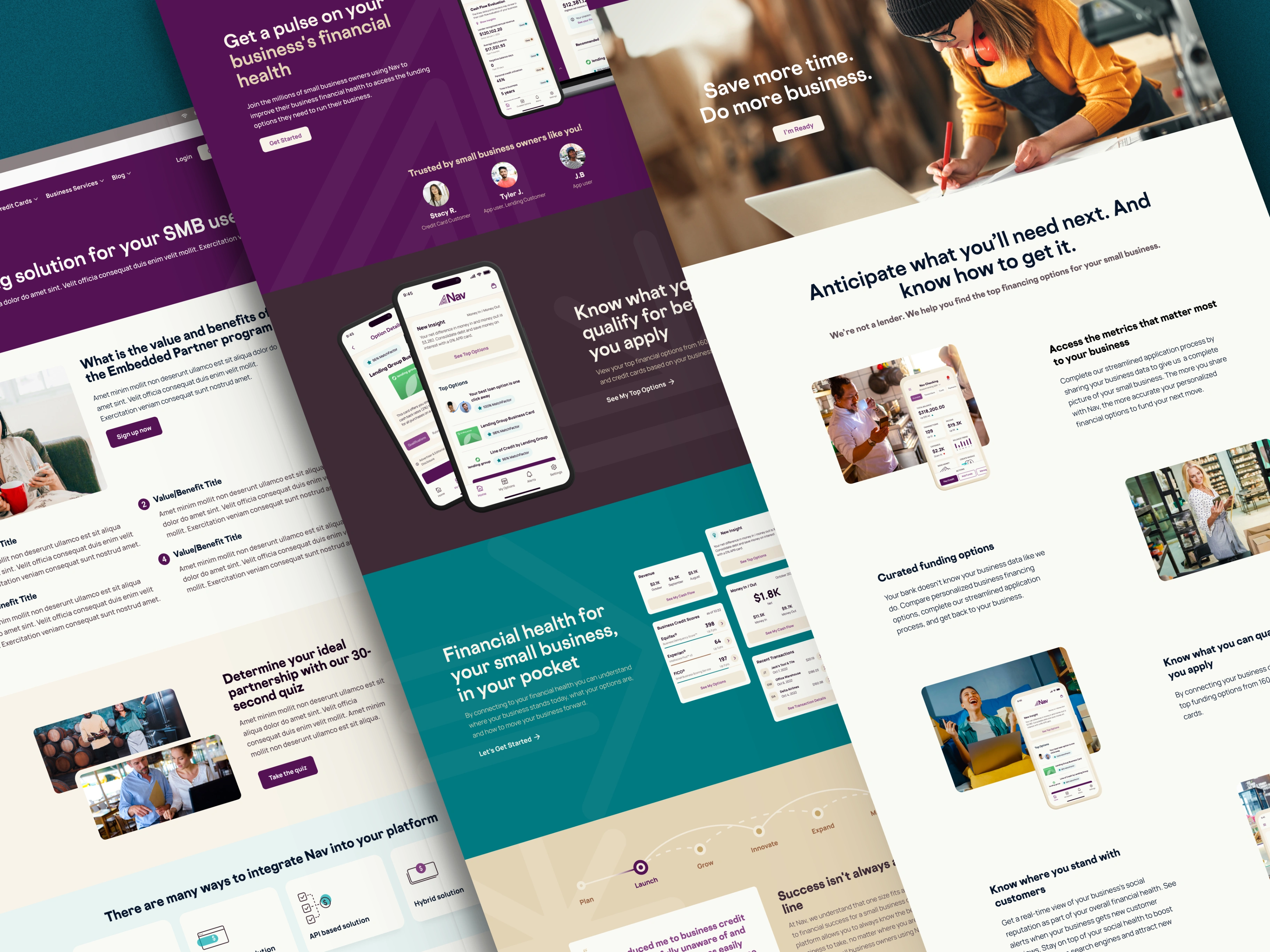
The core decision was to build a design language that extended the client's logo and palette rather than competing with them. That meant defining everything the client hadn't: a typographic scale with clear hierarchy roles, a spatial system (8px base grid, consistent section cadences), an icon and illustration approach that felt native to the palette, and a motion language conservative enough to not undermine trust signals. We deliberately avoided a high-saturation accent system — the temptation in fintech is to signal energy with bright color, but Nav's user is a business owner weighing a financial decision, not a consumer impulse-buying. Restraint in the color application let the existing palette breathe and read as more premium than it had before. The IA work reduced the top-level navigation and reordered the product story to lead with credit health — Nav's clearest differentiator — before introducing financing and cash flow as adjacent tools. Execution was staged: design system foundations first (tokens, type, color application rules, core component patterns), then page-level design in Figma starting with the homepage and pricing page since those carried the highest conversion weight, then frontend build in parallel as designs were approved. The component system was built to be maintainable by Nav's internal team post-handoff — tokens exposed as CSS custom properties, components documented with usage notes, no bespoke one-off patterns that would create maintenance debt. Design led by Boneyard's senior design side; frontend built by Boneyard's engineering side with the same designer in the room throughout to catch drift between spec and implementation.
The outcome
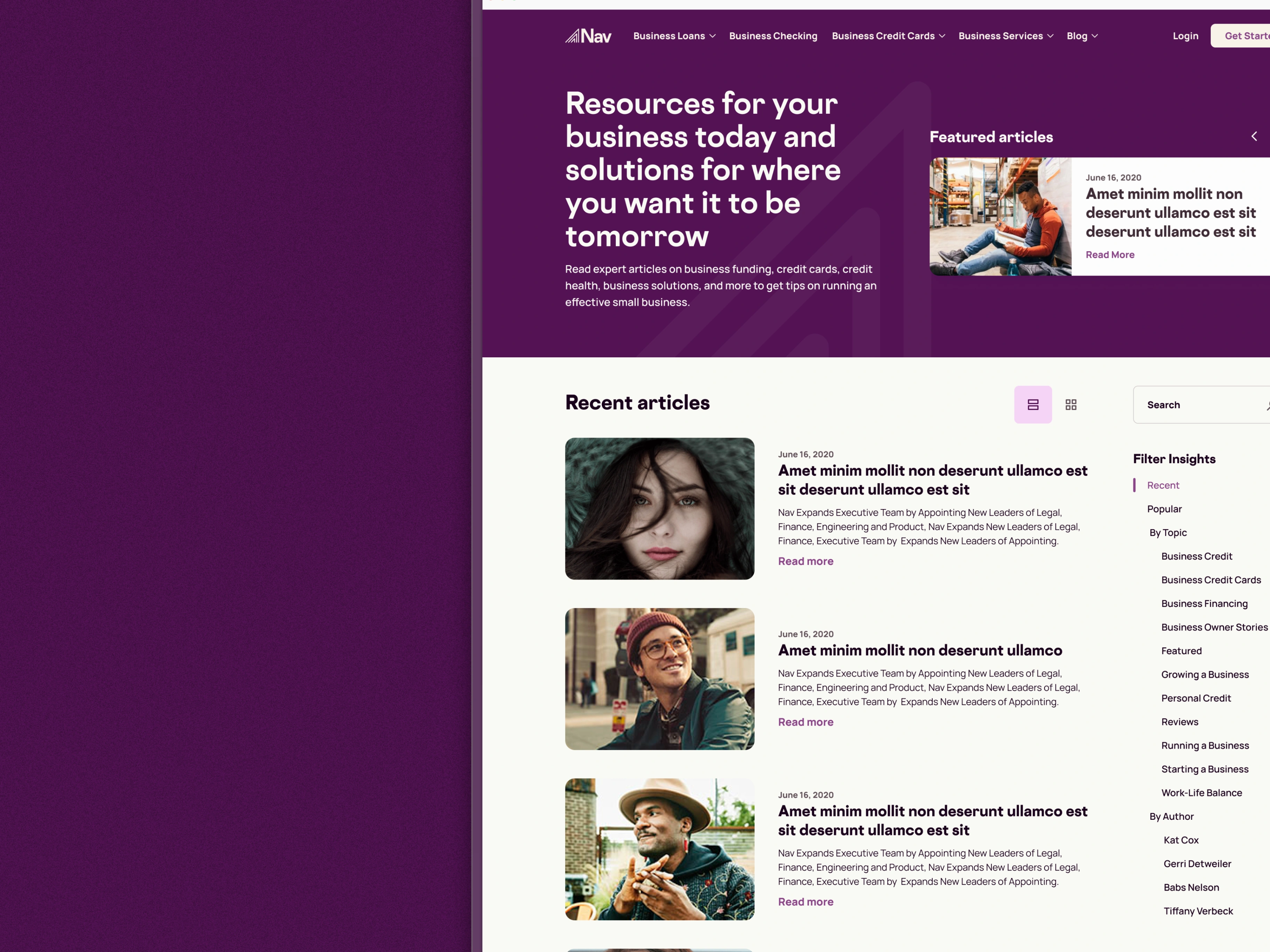
The redesigned site gave Nav a visual foundation that holds up next to well-funded competitors like Experian's SMB tools and Credit Karma for Business — categories where first impressions determine whether a user continues into the signup funnel or bounces. The new design language — applied consistently from the homepage through the pricing page to supporting editorial content — signals the kind of institutional credibility Nav's product had earned but the previous site wasn't communicating. Internally, the component system and token architecture mean Nav's team can extend the site — new landing pages, campaign pages, product feature announcements — without returning to a design bottleneck or introducing visual inconsistency. The handoff included the full Figma system and documented frontend components, so the work functions as infrastructure, not just a finished artifact.
Part 01
What we inherited
The previous site was a Bootstrap-based accumulation of product additions — functional, but without a visual logic connecting its parts. Typography was inconsistent across sections, color was applied without a system, and the component patterns didn't reinforce each other. For a platform asking users to trust it with sensitive financial data, the incoherence had a measurable cost.

Part 02
Fixed inputs, open canvas
The client came with a logo and a color palette already decided. Boneyard's job was to build everything else: the typographic scale, the spatial system, the motion language, the component vocabulary. Working from fixed brand primitives rather than a blank slate is a different kind of design problem — the constraints are real, but so is the speed advantage.

Part 03
A case for restraint
We chose a controlled color application strategy over a high-saturation accent system. The logic: Nav's user is a business owner making a considered financial decision, not a consumer responding to visual stimulus. Letting the palette breathe — using the primary colors for hierarchy signals rather than decoration — made the brand read more settled and authoritative.

Part 04
Rebuilding the type system
The typographic scale was built with explicit hierarchy roles — display, heading, subheading, body, caption — each tied to use cases rather than arbitrary size steps. Section cadences were standardized on an 8px base grid so that visual rhythm held across page templates without per-page negotiation.
Part 05
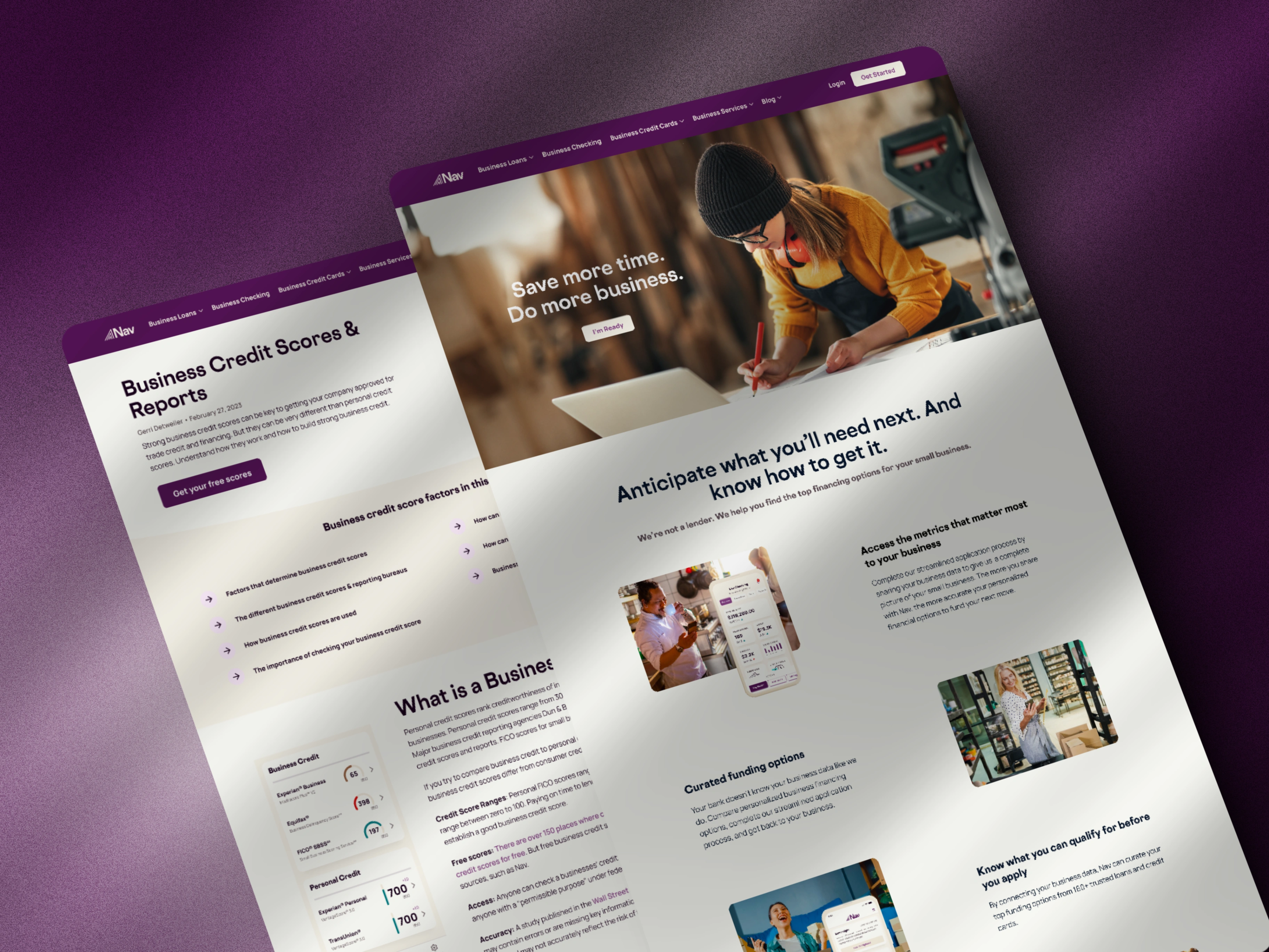
The homepage decision
The homepage was designed to lead with credit health — Nav's clearest point of differentiation — before introducing financing access and cash flow tools as the natural next layer. The previous version treated the three products as parallel from the start, which diluted the entry point. Sequencing the story changed how users oriented to the platform.
Part 06
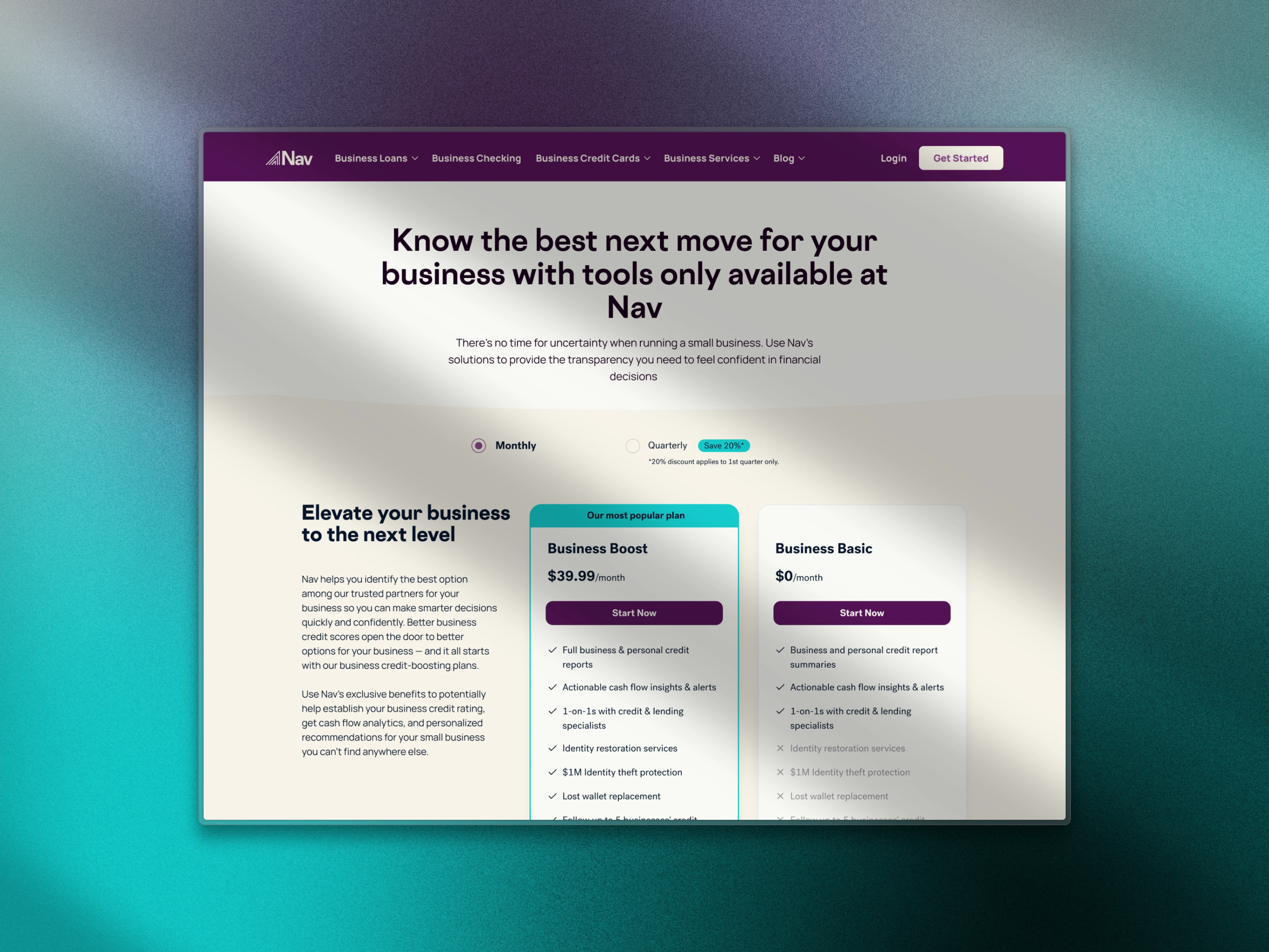
Making the pricing page work
The three-tier Prime structure — Track, Build, Expand — needed a layout that let users self-select without needing to read every line of copy. The redesigned pricing section uses a clear visual weight hierarchy to surface the recommended tier while keeping the comparison readable. The feature checklist was restructured so the differentiating items between tiers are immediately visible.
Part 07
System before pages
Before any full-page design was finalized, Boneyard locked the token layer: color roles, type scale, spacing units, and core component patterns. That sequence meant every page was being designed with real reusable parts, not one-off compositions — and the handoff to Nav's internal team would include a living system, not just finished screens.
Part 08
Design and build in the same room
Frontend development ran in parallel with late-stage design approval rather than sequentially. The same designer who made visual decisions was available during the build to catch drift between spec and implementation — small but compounding things like hover states, responsive breakpoints, and animation timing that determine whether a design system feels coherent or approximate.
Part 09
A foundation, not just a site
The handoff package included the full Figma component system, documented token architecture as CSS custom properties, and usage notes for every major component pattern. Nav's internal team can extend the site — new campaign pages, feature announcements, product updates — without returning to a design agency or risking the visual consistency that the system now enforces.


Next Project
Flutter